
10 N Parameters
It may be time to move from assuming that research has been honestly conducted and reported to assuming it to be untrustworthy until there is some evidence to the contrary. – Richard Smith, former editor of the British Medical Journal.
You are now ready to make the jump to \(N\) parameters.
In this chapter, we will consider models with many parameters and the complexities that arise therefrom. As our models grow in complexity, we need to pay extra attention to basic assumptions like validity, stability, representativeness, and unconfoundedness. It is (too!) easy to jump right in and start interpreting. It is harder, but necessary, to ensure that our models are really answering our questions.
Imagine you are a Republican running for Governor in Texas. You need to allocate your campaign spending intelligently. For example, you want to do a better job of getting your voters to vote.
How can you encourage politically engaged voters to go out to the polls on election day?
10.1 Wisdom
As you research ways to increase voting, you come across a large-scale experiment showing the effect of sending out a voting reminder that “shames” citizens who do not vote. Perhaps you should pay to send out a shaming voting postcard.
We will be looking at the shaming tibble from the primer.data package, sourced from “Social Pressure and Voter Turnout: Evidence from a Large-Scale Field Experiment” (pdf) by Gerber, Green, and Larimer (2008). Familiarize yourself with the data by typing ?shaming.
Recall our initial question: how can we encourage voters to go out to the polls on election day? We now need to translate this into a more precise question, one that we can answer with data.
What is the causal effect of postcards on voting?
Wisdom requires the creation of a Preceptor Table, an examination of our data, and a determination, using the concept of validity, as to whether or not we can (reasonably!) assume that the two come from the same population.
10.1.1 Preceptor Table
Causal or predictive model: The phrasing of the question — especially the phrase “causal effect” — makes it obvious that we need a causal, rather than a predictive, model. There will be at least two potential outcomes for every unit.
Units: The units of our Preceptor Table are individual voters in Texas around the time of the next election.
Outcome: The outcome is voting or not voting. That is, we are researching the question of how to convince people to vote, not how to convince them to vote for a specific candidate. This project is about getting our voters to the polls, not about convincing their voters to switch to our side.
Treatment: The treatments are postcards of various types.
Covariates: The covariates include, at least, measures of political engagement, since that attribute was mentioned in the initial question. There may be other covariates as well. We can’t get too detailed until we look at the data.
Moment in Time: We care about the upcoming Texas election.
The Preceptor Table is the smallest possible table such that, if no data were missing, the calculation of all quantities of interest would be trivial. The causal effect, for each individual, is the difference in voting behavior under treatment versus control. Consider:
| Preceptor Table | ||||
|---|---|---|---|---|
| ID |
Outcomes
|
Covariates
|
||
| Voting After Control | Voting After Treatment | Treatment | Engagement | |
| 1 | 1 | 1 | Yes | 1 |
| 2 | 0 | 1 | No | 3 |
| … | … | … | … | … |
| 10 | 1 | 1 | Yes | 6 |
| 11 | 1 | 0 | Yes | 2 |
| … | … | … | … | … |
| N | 0 | 1 | No | 2 |
Comments:
The more experience you get as a data scientist, the more that you will come to understand that the Four Cardinal Virtues are not a one-way path. Instead, we circle round and round. Our initial question, instead of being fixed forever, is modified as we learn more about the data, and as we experiment with different modeling approaches.
Indeed, the politician (our boss/client) running for Texas governor probably did not start out with that question. After all, his main question is “How do I win this election?” That big picture goal would lead, over and over again, to more specific questions regarding strategy, including how best to motivate his supporters to vote.
The same iterative approach applies to the Preceptor Table. The above is just our first version. Once we look more closely at the data, we will discover that there are multiple treatments. In fact, we have a total of 5 potential outcomes in this example.
Should we go back and change the Preceptor Table? No! The Preceptor Table is just a tool we use to fix ideas in our own heads. We never talk about Preceptor Tables with anyone else. Indeed, you won’t ever see the words “Preceptor Table” outside of this Primer and related work.
Why is there only one covariate (in addition to the treatment)? Because the question only specifies that one. Any covariates mentioned in the question must be included in the Preceptor Table because, without that information for all units, we can’t answer the question. In any real example, we will have other covariates which we might, or might not, include in the model.
The outcomes in a Preceptor Table refer to a moment in time. In this case, the outcome occurs on Election Day in 2026. The covariates and treatments must be measured before the outcome, otherwise they can’t be modeled as connected with the outcome.
We can update our question:
What is the causal effect of postcards on voting in the 2026 Texas gubernatorial election? Do those effects vary by political engagement?
As usual, our question becomes both more and less precise simultaneously. It is more precise in that we only care about a very specific moment in space and time: the election for governor in Texas in 2026. It is less precise in that we are almost always interested in different aspects of the problem, mainly because of the decisions we must make.
In this case, we might not have enough money to send postcards to every voter. Maybe we should focus in politically engaged voters. Maybe we should focus on other subsets. We should probably only send postcards to voters who are Republican or are likely to vote Republican, unless, that is, some postcards actually decrease someone’s proposensity to vote. The real world is full of complexity.
10.1.2 EDA of shaming
After loading the packages we need, let’s perform an EDA, starting off by running glimpse() on the shaming tibble from the primer.data package.
Show the code
glimpse(shaming)Rows: 344,084
Columns: 13
$ cluster <chr> "1", "1", "1", "1", "1", "1", "1", "1", "1", "1", "1", "1",…
$ primary_06 <int> 0, 0, 1, 1, 1, 0, 1, 1, 0, 0, 1, 0, 1, 0, 1, 1, 0, 0, 1, 1,…
$ treatment <fct> Civic Duty, Civic Duty, Hawthorne, Hawthorne, Hawthorne, No…
$ sex <chr> "Male", "Female", "Male", "Female", "Female", "Male", "Fema…
$ age <int> 65, 59, 55, 56, 24, 25, 47, 50, 38, 39, 65, 61, 57, 37, 39,…
$ primary_00 <int> 0, 0, 0, 0, 0, 0, 0, 0, 0, 0, 0, 0, 0, 0, 1, 0, 0, 0, 0, 0,…
$ general_00 <int> 1, 1, 1, 1, 1, 0, 1, 1, 0, 1, 1, 1, 1, 1, 1, 1, 1, 0, 1, 1,…
$ primary_02 <int> 1, 1, 1, 1, 1, 0, 1, 1, 1, 1, 0, 0, 1, 0, 1, 1, 0, 0, 1, 1,…
$ general_02 <int> 1, 1, 1, 1, 1, 0, 1, 1, 0, 1, 1, 1, 1, 0, 1, 1, 1, 0, 1, 1,…
$ primary_04 <int> 0, 0, 0, 0, 0, 0, 0, 0, 0, 0, 1, 0, 0, 1, 1, 1, 0, 0, 0, 0,…
$ general_04 <int> 1, 1, 1, 1, 1, 1, 1, 1, 1, 1, 1, 1, 1, 1, 1, 1, 1, 1, 1, 1,…
$ hh_size <int> 2, 2, 3, 3, 3, 3, 3, 3, 2, 2, 1, 2, 2, 1, 2, 2, 2, 2, 1, 1,…
$ neighbors <int> 21, 21, 21, 21, 21, 21, 21, 21, 21, 21, 21, 21, 21, 21, 21,…glimpse() gives us a look at the raw data contained within the shaming data set. At the very top of the output, we can see the number of rows and columns, or observations and variables, respectively. We see that there are 344,084 observations, with each row corresponding to a unique respondent. ?shaming provides more details about the variables.
Variables of particular interest to us are sex, hh_size, and primary_06. The variable hh_size tells us the size of the respondent’s household, sex tells us the sex of the respondent, and primary_06 tells us whether or not the respondent voted in the 2006 primary election.
There are a few things to note while exploring this data set. You may – or may not – have noticed that the only value for the general_04 variable is 1, meaning that every person in the data voted in the 2004 general election. In their published article, the authors note that “Only registered voters who voted in November 2004 were selected for our sample.” After this, the authors found the voting history for those individuals and then sent out the mailings. Thus, anyone who did not vote in the 2004 general election is excluded, by definition. Keep that fact in mind when we discuss representativeness below.
The dependent variable is primary_06, which is coded either 1 or 0 for whether or not the respondent voted in the 2006 primary election. This is the dependent variable because the authors are trying to measure the effect that the treatments have on voting behavior in the 2006 general election. It is also the dependent variable from our point of view since our question also deals with voting behavior.
The treatment variable is a factor variable with 5 levels, including the control. Our focus is on those treatments, and on their causal effects, if any. Consider:
Show the code
shaming |>
  count(treatment)
# A tibble: 5 × 2
treatment n
<fct> <int>
1 No Postcard 191243
2 Civic Duty 38218
3 Hawthorne 38204
4 Self 38218
5 Neighbors 38201Four types of treatments were used in the experiment, with voters receiving one of the four types of mailing. All of the mailing treatments carried the message, “DO YOUR CIVIC DUTY - VOTE!”.
The first treatment, Civic Duty, also read, “Remember your rights and responsibilities as a citizen. Remember to vote.” This message acted as a baseline for the other treatments, since it carried a message very similar to the one displayed on all the mailings.
In the second treatment, Hawthorne, households received a mailing which told the voters that they were being studied and their voting behavior would be examined through public records. This adds a small amount of social pressure.
In the third treatment, Self, the mailing includes the recent voting record of each member of the household, placing the word “Voted” next to their name if they did in fact vote in the 2004 election or a blank space next to the name if they did not. In this mailing, the households were also told, “we intend to mail an updated chart” with the voting record of the household members after the 2006 primary. By emphasizing the public nature of voting records, this type of mailing exerts more social pressure on voting than the Hawthorne treatment.
The fourth treatment, Neighbors, provides the household members’ voting records, as well as the voting records of those who live nearby. This mailing also told recipients, “we intend to mail an updated chart” of who voted in the 2006 election to the entire neighborhood. Consider:
Show the code
shaming |>
  sample_frac(0.05) |>
  ggplot(aes(x = treatment, y = primary_06)) +
    geom_jitter(alpha = 0.03, height = 0.1) +
    scale_y_continuous(breaks = c(0, 1), labels = c("No", "Yes")) +
    labs(title = "Postcards and Voting Behavior in Michigan",
         subtitle = "Most residents did not receive a postcard.",
         x = "Postcard Type Sent to Voter",
         y = "Voted in 2006 Primary Election",
         caption = "Random sample of 5% of the data from Gerber, Green, and Larimer (2008)")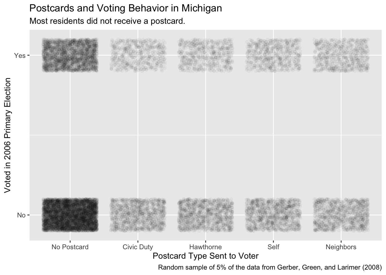
This graphic does not tell us as much as we might like. Most residents did not receive a postcard. Those who did get a postcard had about the same chance of receiving any of the four types of postcard. Since the lower bars are darker, more people in the sample did not vote in the election than did vote. However, we can’t really see, much less estimate, a causal effect from this graphic.
The original question mentions “civic engagement.” Although shaming does not include any variable exactly like this, it does include voting history. Consider:
x <- shaming |>


  # A sum of the voting action records across the election cycle columns gives
  # us an idea of the voters general level of civic involvement.

  mutate(civ_engage = primary_00 + primary_02 + primary_04 +
                      general_00 + general_02 + general_04) |>

  # If you look closely at the data, you will note that general_04 is always Yes, so
  # the lowest possible value of civ_engage is 1. The reason for this is that
  # the sample was created by starting with a list of everyone who voted in the
  # 2004 general election. Note how that fact makes the interpretation of the
  # relevant population somewhat subtle.

  mutate(voter_class = case_when(civ_engage %in% c(5, 6) ~ "Always Vote",
                                 civ_engage %in% c(3, 4) ~ "Sometimes Vote",
                                 civ_engage %in% c(1, 2) ~ "Rarely Vote"),
         voter_class = factor(voter_class, levels = c("Rarely Vote",
                                                      "Sometimes Vote",
                                                      "Always Vote"))) |>

  # Centering and scaling the age variable. Note that it would be smart to have
  # some stopifnot() error checks at this point. For example, if civ_engage < 1
  # or > 6, then something has gone very wrong.

  mutate(age_z = as.numeric(scale(age))) |>

  # voted in a more natural name for our outcome variable

  rename(voted = primary_06) |>

  # Just keep the variables that we will be using later.

  select(voted, treatment, sex, age_z, civ_engage, voter_class) |>

  # There are only a handful of rows with missing data, so it can't matter much
  # if we drop them.

  drop_na()
Read all those comments! Your code should be commented just as thoroughly. Rough guideline: Have as many lines of comments as you have lines of code.
Of course, when doing the analysis, you don’t know when you start what you will be using at the end. Data analysis is a circular process. We mess with the data. We do some modeling. We mess with the data on the basis of what we learned from the models. With this new data, we do some more modeling. And so on. Consider:
Show the code
x |>
  sample_frac(0.05) |>
  ggplot(aes(x = civ_engage, y = voted)) +
    geom_jitter(alpha = 0.03, height = 0.1) +
    scale_x_continuous(breaks = 1:6) +
    scale_y_continuous(breaks = c(0, 1), labels = c("No", "Yes")) +
    labs(title = "Civic Engagement and Voting Behavior in Michigan",
         subtitle = "Past voting predicts future voting.",
         x = "Civic Engagement",
         y = "Voted in 2006 Primary Election",
         caption = "Random sample of 5% of the data from Gerber, Green, and Larimer (2008)")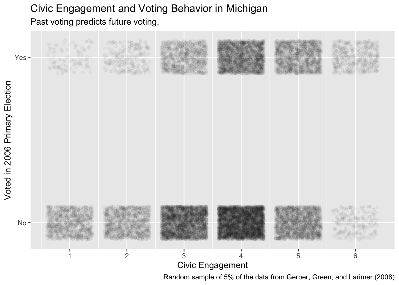
Although this plot is pleasing, we need to create an actual model with this data in order to answer our questions.
10.1.3 Validity
Validity is the consistency, or lack there of, in the columns of your data set and the corresponding columns in your Preceptor Table. In order to consider the two data sets to be drawn from the same population, the columns from one must have a valid correspondence with the columns in the other. Validity, if true (or at least reasonable), allows us to construct the Population Table, which is the first step in Justice. Consider two counter-arguments to the assumption of validity in this case.
First, voting in a primary election in 2006 in Michigan is not the same thing as voting in a general election in Texas in 2026. Primary elections are less newsworthy and, usually, less competitive. Our client, the gubernatorial candidate, has already won his primary. The outcome he cares about is voting in a general elections. Treatments which might, or might not, affect participation in a primary are irrelevant. Moreover, the political culture of Texas and Michigan are very different. The meaning and importance of voting is not identical across states, nor over time.
Second, our client is interested in using a measure of civic engagement. We build that measure out of past voting behavior. Right now, we aren’t even sure that we can access this data in Texas. And, even if we can, the salience of those elections in the years before 2026 will differ from those in Michigan in the years before 2006.
Fortunately, at least for our continued use of this example, we will assume that validity holds. The outcome variable in our data and in our Preceptor Table are close enough — even though one is for a primary election while the other is for a general election — that we can just stack them.
Using the results of a voting experiment in Michigan in 2006, we seek to forecast the causal effect on voter participation of sending postcards in the Texas gubernatorial general election of 2026.
10.2 Justice

Justice includes the creation of the Population Table, followed by a discussion about the assumptions of stability, representativeness and unconfoundedness.
10.2.1 The Population Table
The Population Table shows rows from three sources: the Preceptor Table, the data, and the population from which the rows in both the Preceptor Table and the data were drawn.
The better we get at data science, the less that we sweat the details of the Population Table.
| Source | Sex | Year | State |
Outcomes
|
|
|---|---|---|---|---|---|
| Treatment | Control | ||||
| … | ? | 1990 | ? | ? | ? |
| … | ? | 1995 | ? | ? | ? |
| … | … | … | … | … | … |
| Data | Male | 2006 | Michigan | Did not vote | ? |
| Data | Female | 2006 | Michigan | ? | Voted |
| … | … | … | … | … | … |
| … | ? | 2010 | ? | ? | ? |
| … | ? | 2012 | ? | ? | ? |
| … | … | … | … | … | … |
| Preceptor Table | Female | 2026 | Texas | ? | ? |
| Preceptor Table | Female | 2026 | Texas | ? | ? |
| … | … | … | … | … | … |
| … | ? | 2046 | ? | ? | ? |
| … | ? | 2050 | ? | ? | ? |
Does the underlying population go back to 1990, or only 1995? Does it include elections in 2040? How about 2050? Are states other than Texas and Michigan included? How about town or municipal elections? Other countries?
The reason that we don’t worry about those details is that they don’t matter to the problem we are trying to solve. Whether or not the population includes voters in 2040 and/or in Toronto does not really matter to our attempts to draw inferences about Texas in 2026.
We also don’t worry about getting other details correct. For example, we know that this experiment includes four post cards, plus the control. That is five potential outcomes, and 10 possible causal effects, since the definition of a causal effect in the difference between any two potential outcomes. We don’t bother to include all those details in the Population Table.
Recall that the purpose of the Preceptor Table is to force us to answer the key questions. Is the model predictive or causal? What are the units, outcomes and covariates/treatments?
Similarly, the purpose of the Population Table is to force us to think hard about the key assumptions of validity, stability, representativeness, and unconfoundedness.
10.2.2 Stability
Stability means that the relationship between the columns is the same for three categories of rows: the data, the Preceptor table, and the larger population from which both are drawn. Of course, what we most need is for the relationship between the columns to be the same between the data and the Preceptor Table. If it isn’t, then we can’t use models estimated on the former to make inferences about the latter. But it is weird to just assume a connection between in Michigan in 2006 and Texas in 2026. Any such assumption is really a broader claim about many years and many jurisdictions. Our description of the underlying population is the glue which connects the data and the Preceptor Table.
Is data collected in 2006 on voting behavior likely to be the same in 2026? Frankly, we don’t know! We aren’t sure what would impact someone’s response to a postcard encouraging them to vote. It is possible, for instance, that a postcard informing neighbors of voting status has a bigger effect in a world with more social media.
When we are confronted with this uncertainty, we can consider making our timeframe smaller. However, we would still need to assume stability from 2006 (time of data collection) to 2026. Stability allows us to ignore the issue of time.
10.2.3 Representativeness
Even if the stability assumption holds, we still have problems with representativeness because Michigan and Texas are (very?) different states. In one sense, neither the data nor the Preceptor Table is a sample. Both include, more or less, the entire electorates in their respective states. But, from the point of view of the Population Table, they are both samples from the underling population. Even if we, with the help of the stability assumption, don’t think that anything has changes between 2006 and 2026, we are still trying to use data from Michigan to make an inference about Texas. The obvious problem is that voters in Michigan are (very?) different from voters in Texas, in all sorts of ways which might matter to our analysis.
10.2.4 Unconfoundedness
The great advantage of randomized assignment of treatment is that it guarantees unconfoundedness. There is no way for treatment assignment to be correlated with anything, including potential outcomes, if treatment assignment is random.
Using the results of a voting experiment in Michigan in 2006 primary election, we seek to forecast the causal effect on voter participation of sending postcards in the Texas gubernatorial general election of 2026. There is concern that data from a primary election might not generalize to a general election and that political culture in the two states differ too much to allow for data from one to enable useful forecasts in the other.
10.3 Courage

10.3.1 Models
Justice gave us the Population Table. Courage selects the data generating mechanism. We first specify the mathematical formula which connects the outcome variable we are interested in with the other data that we have. We explore different models. We need to decide which variables to include and to estimate the values of unknown parameters. We check our models for consistency with the data we have. We avoid hypothesis tests. We select one model, the data generating mechanism or DGM.
Given that the outcome variable is 0/1, a logistic model is the obvious choice. However, in this case, a linear model with a normal error term provides more or less the same answer.
We will need our usual modeling packages:
10.3.1.1 voted ~ treatment + sex
In this section, we will look at the relationship between primary voting and treatment + sex.
The math:
Without variable names:
\[ y_{i} = \beta_{0} + \beta_{1}x_{i, 1} + \beta_{2}x_{i,2} ... + \beta_{n}x_{i,n} + \epsilon_{i} \] With variable names:
\[ voted_{i} = \beta_{0} + \beta_{1}civic\_duty_i + \beta_{2}hawthorne_i + \beta_{3}self_i + \beta_{4}neighbors_i + \beta_{5}male_i + \epsilon_{i} \]
There are two ways to formalize the model used in fit_1: with and without the variable names. The former is related to the concept of Justice as we acknowledge that the model is constructed via the linear sum of n parameters times the value for n variables, along with an error term. In other words, it is a linear model. The only other model we have learned this semester is a logistic model, but there are other kinds of models, each defined by the mathematics and the assumptions about the error term.
The second type of formal notation, more associated with the virtue Courage, includes the actual variable names we are using. The trickiest part is the transformation of character/factor variables into indicator variables, meaning variables with 0/1 values. Because treatment has 5 levels, we need 4 indicator variables. The fifth level — which, by default, is the first variable alphabetically (for character variables) or the first level (for factor variables) — is incorporated in the intercept.
Let’s translate the model into code.
fit_1 <- brm(formula = voted ~ treatment + sex,
             data = x,
             family = gaussian(),
             refresh = 0,
             silent = 2,
             seed = 99)
Trying to compile a simple C fileRunning /Library/Frameworks/R.framework/Resources/bin/R CMD SHLIB foo.c
using C compiler: ‘Apple clang version 15.0.0 (clang-1500.3.9.4)’
using SDK: ‘’
clang -arch arm64 -I"/Library/Frameworks/R.framework/Resources/include" -DNDEBUG -I"/Library/Frameworks/R.framework/Versions/4.4-arm64/Resources/library/Rcpp/include/" -I"/Library/Frameworks/R.framework/Versions/4.4-arm64/Resources/library/RcppEigen/include/" -I"/Library/Frameworks/R.framework/Versions/4.4-arm64/Resources/library/RcppEigen/include/unsupported" -I"/Library/Frameworks/R.framework/Versions/4.4-arm64/Resources/library/BH/include" -I"/Library/Frameworks/R.framework/Versions/4.4-arm64/Resources/library/StanHeaders/include/src/" -I"/Library/Frameworks/R.framework/Versions/4.4-arm64/Resources/library/StanHeaders/include/" -I"/Library/Frameworks/R.framework/Versions/4.4-arm64/Resources/library/RcppParallel/include/" -I"/Library/Frameworks/R.framework/Versions/4.4-arm64/Resources/library/rstan/include" -DEIGEN_NO_DEBUG -DBOOST_DISABLE_ASSERTS -DBOOST_PENDING_INTEGER_LOG2_HPP -DSTAN_THREADS -DUSE_STANC3 -DSTRICT_R_HEADERS -DBOOST_PHOENIX_NO_VARIADIC_EXPRESSION -D_HAS_AUTO_PTR_ETC=0 -include '/Library/Frameworks/R.framework/Versions/4.4-arm64/Resources/library/StanHeaders/include/stan/math/prim/fun/Eigen.hpp' -D_REENTRANT -DRCPP_PARALLEL_USE_TBB=1 -I/opt/R/arm64/include -fPIC -falign-functions=64 -Wall -g -O2 -c foo.c -o foo.o
In file included from <built-in>:1:
In file included from /Library/Frameworks/R.framework/Versions/4.4-arm64/Resources/library/StanHeaders/include/stan/math/prim/fun/Eigen.hpp:22:
In file included from /Library/Frameworks/R.framework/Versions/4.4-arm64/Resources/library/RcppEigen/include/Eigen/Dense:1:
In file included from /Library/Frameworks/R.framework/Versions/4.4-arm64/Resources/library/RcppEigen/include/Eigen/Core:19:
/Library/Frameworks/R.framework/Versions/4.4-arm64/Resources/library/RcppEigen/include/Eigen/src/Core/util/Macros.h:679:10: fatal error: 'cmath' file not found
#include <cmath>
^~~~~~~
1 error generated.
make: *** [foo.o] Error 1Show the code
print(fit_1, digits = 3) Family: gaussian
Links: mu = identity; sigma = identity
Formula: voted ~ treatment + sex
Data: x (Number of observations: 344084)
Draws: 4 chains, each with iter = 2000; warmup = 1000; thin = 1;
total post-warmup draws = 4000
Regression Coefficients:
Estimate Est.Error l-95% CI u-95% CI Rhat Bulk_ESS Tail_ESS
Intercept 0.291 0.001 0.288 0.293 1.000 4077 3737
treatmentCivicDuty 0.018 0.003 0.013 0.023 1.001 2724 2960
treatmentHawthorne 0.026 0.003 0.021 0.031 0.999 2932 2925
treatmentSelf 0.049 0.003 0.043 0.054 1.000 3168 2972
treatmentNeighbors 0.081 0.003 0.076 0.086 1.000 3201 2742
sexMale 0.012 0.002 0.009 0.015 1.001 5215 3188
Further Distributional Parameters:
Estimate Est.Error l-95% CI u-95% CI Rhat Bulk_ESS Tail_ESS
sigma 0.464 0.001 0.463 0.465 1.001 6852 2997
Draws were sampled using sampling(NUTS). For each parameter, Bulk_ESS
and Tail_ESS are effective sample size measures, and Rhat is the potential
scale reduction factor on split chains (at convergence, Rhat = 1).We will now create a table that nicely formats the results of fit_1 using the tbl_regression() function from the gtsummary package. It will also display the associated 95% confidence interval for each coefficient.
Show the code
tbl_regression(fit_1,
               intercept = TRUE,
               estimate_fun = function(x) style_sigfig(x, digits = 3)) |>

  # Using Beta as the name of the parameter column is weird.

  as_gt() |>
  tab_header(title = md("**Likelihood of Voting in the Next Election**"),
             subtitle = "How Treatment Assignment and Age Predict Likelihood of Voting") |>
  tab_source_note(md("Source: Gerber, Green, and Larimer (2008)")) |>
cols_label(estimate = md("**Parameter**"))| Likelihood of Voting in the Next Election | ||
| How Treatment Assignment and Age Predict Likelihood of Voting | ||
| Characteristic | Parameter | 95% CI1 |
|---|---|---|
| (Intercept) | 0.291 | 0.288, 0.293 |
| treatment | ||
| No Postcard | — | — |
| treatmentCivicDuty | 0.018 | 0.013, 0.023 |
| Hawthorne | 0.026 | 0.021, 0.031 |
| Self | 0.049 | 0.043, 0.054 |
| Neighbors | 0.081 | 0.076, 0.086 |
| sex | ||
| sexMale | 0.012 | 0.009, 0.015 |
| Source: Gerber, Green, and Larimer (2008) | ||
| 1 CI = Credible Interval | ||
Interpretation:
The intercept of this model is the expected value of the probability of someone voting in the 2006 primary given that they are part of the control group and are female. In this case, we estimate that women in the control group will vote ~29% of the time.
The coefficient for
sexMaleindicates the difference in likelihood of voting between a male and female. In other words, when comparing men and women, the 0.012 implies that men are ~1.2% more likely to vote than women. Note that, because this is a linear model with no interactions between sex and other variables, this difference applies to any male, regardless of the treatment he received. Because sex can not be manipulated (by assumption), we should not use a causal interpretation of the coefficient.The coefficients of the treatments, on the other hand, do have a causal interpretation. For a single individual, of either sex, being sent the Self postcard increases your probability of voting by 4.9%. It appears that the
Neighborstreatment is the most effective at ~8.1% andCivic Dutyis the least effective at ~1.8%.
10.3.1.2 voted ~ age_z + sex + treatment + voter_class + voter_class*treatment
It is time to look at interactions! Create another model named fit_2 that estimates voted as a function of age_z, sex, treatment, voter_class, and the interaction between treatment and voter classification.
The math:
\[y_{i} = \beta_{0} + \beta_{1} age\_z + \beta_{2}male_i + \beta_{3}civic\_duty_i + \\ \beta_{4}hawthorne_i + \beta_{5}self_i + \beta_{6}neighbors_i + \\ \beta_{7}Sometimes\ vote_i + \beta_{8}Always\ vote_i + \\ \beta_{9}civic\_duty_i Sometimes\ vote_i + \beta_{10}hawthorne_i Sometimes\ vote_i + \\ \beta_{11}self_i Sometimes\ vote_i + \beta_{11}neighbors_i Sometimes\ vote_i + \\ \beta_{12}civic\_duty_i Always\ vote_i + \beta_{13}hawthorne_i Always\ vote_i + \\ \beta_{14}self_i Always\ vote_i + \beta_{15}neighbors_i Always\ vote_i + \epsilon_{i}\] Translate into code:
fit_2 <- brm(formula = voted ~ age_z + sex + treatment + voter_class +
                            treatment*voter_class,
             data = x,
             family = gaussian(),
             refresh = 0,
             silent = 2,
             seed = 19)
Trying to compile a simple C fileRunning /Library/Frameworks/R.framework/Resources/bin/R CMD SHLIB foo.c
using C compiler: ‘Apple clang version 15.0.0 (clang-1500.3.9.4)’
using SDK: ‘’
clang -arch arm64 -I"/Library/Frameworks/R.framework/Resources/include" -DNDEBUG -I"/Library/Frameworks/R.framework/Versions/4.4-arm64/Resources/library/Rcpp/include/" -I"/Library/Frameworks/R.framework/Versions/4.4-arm64/Resources/library/RcppEigen/include/" -I"/Library/Frameworks/R.framework/Versions/4.4-arm64/Resources/library/RcppEigen/include/unsupported" -I"/Library/Frameworks/R.framework/Versions/4.4-arm64/Resources/library/BH/include" -I"/Library/Frameworks/R.framework/Versions/4.4-arm64/Resources/library/StanHeaders/include/src/" -I"/Library/Frameworks/R.framework/Versions/4.4-arm64/Resources/library/StanHeaders/include/" -I"/Library/Frameworks/R.framework/Versions/4.4-arm64/Resources/library/RcppParallel/include/" -I"/Library/Frameworks/R.framework/Versions/4.4-arm64/Resources/library/rstan/include" -DEIGEN_NO_DEBUG -DBOOST_DISABLE_ASSERTS -DBOOST_PENDING_INTEGER_LOG2_HPP -DSTAN_THREADS -DUSE_STANC3 -DSTRICT_R_HEADERS -DBOOST_PHOENIX_NO_VARIADIC_EXPRESSION -D_HAS_AUTO_PTR_ETC=0 -include '/Library/Frameworks/R.framework/Versions/4.4-arm64/Resources/library/StanHeaders/include/stan/math/prim/fun/Eigen.hpp' -D_REENTRANT -DRCPP_PARALLEL_USE_TBB=1 -I/opt/R/arm64/include -fPIC -falign-functions=64 -Wall -g -O2 -c foo.c -o foo.o
In file included from <built-in>:1:
In file included from /Library/Frameworks/R.framework/Versions/4.4-arm64/Resources/library/StanHeaders/include/stan/math/prim/fun/Eigen.hpp:22:
In file included from /Library/Frameworks/R.framework/Versions/4.4-arm64/Resources/library/RcppEigen/include/Eigen/Dense:1:
In file included from /Library/Frameworks/R.framework/Versions/4.4-arm64/Resources/library/RcppEigen/include/Eigen/Core:19:
/Library/Frameworks/R.framework/Versions/4.4-arm64/Resources/library/RcppEigen/include/Eigen/src/Core/util/Macros.h:679:10: fatal error: 'cmath' file not found
#include <cmath>
^~~~~~~
1 error generated.
make: *** [foo.o] Error 1Show the code
print(fit_2, digits = 3) Family: gaussian
Links: mu = identity; sigma = identity
Formula: voted ~ age_z + sex + treatment + voter_class + treatment * voter_class
Data: x (Number of observations: 344084)
Draws: 4 chains, each with iter = 2000; warmup = 1000; thin = 1;
total post-warmup draws = 4000
Regression Coefficients:
Estimate Est.Error l-95% CI
Intercept 0.153 0.003 0.147
age_z 0.035 0.001 0.034
sexMale 0.008 0.002 0.005
treatmentCivicDuty 0.010 0.007 -0.003
treatmentHawthorne 0.008 0.007 -0.006
treatmentSelf 0.023 0.007 0.010
treatmentNeighbors 0.044 0.007 0.031
voter_classSometimesVote 0.114 0.003 0.108
voter_classAlwaysVote 0.294 0.004 0.287
treatmentCivicDuty:voter_classSometimesVote 0.014 0.008 -0.000
treatmentHawthorne:voter_classSometimesVote 0.019 0.008 0.004
treatmentSelf:voter_classSometimesVote 0.030 0.007 0.016
treatmentNeighbors:voter_classSometimesVote 0.042 0.007 0.028
treatmentCivicDuty:voter_classAlwaysVote -0.001 0.009 -0.018
treatmentHawthorne:voter_classAlwaysVote 0.025 0.009 0.008
treatmentSelf:voter_classAlwaysVote 0.025 0.009 0.009
treatmentNeighbors:voter_classAlwaysVote 0.046 0.008 0.030
u-95% CI Rhat Bulk_ESS Tail_ESS
Intercept 0.159 1.000 3155 2804
age_z 0.037 1.000 4474 3058
sexMale 0.011 1.000 4514 2678
treatmentCivicDuty 0.023 1.001 2741 2837
treatmentHawthorne 0.021 1.003 3052 2808
treatmentSelf 0.036 1.001 3125 2848
treatmentNeighbors 0.057 1.002 2901 2652
voter_classSometimesVote 0.121 1.000 3113 2702
voter_classAlwaysVote 0.301 1.000 3266 2930
treatmentCivicDuty:voter_classSometimesVote 0.029 1.002 2695 2832
treatmentHawthorne:voter_classSometimesVote 0.034 1.001 3055 2787
treatmentSelf:voter_classSometimesVote 0.044 1.001 3318 2910
treatmentNeighbors:voter_classSometimesVote 0.057 1.001 2998 2678
treatmentCivicDuty:voter_classAlwaysVote 0.015 1.000 2888 2807
treatmentHawthorne:voter_classAlwaysVote 0.043 1.002 3157 2618
treatmentSelf:voter_classAlwaysVote 0.041 1.001 3249 2620
treatmentNeighbors:voter_classAlwaysVote 0.063 1.001 2972 2643
Further Distributional Parameters:
Estimate Est.Error l-95% CI u-95% CI Rhat Bulk_ESS Tail_ESS
sigma 0.451 0.001 0.450 0.452 1.002 4727 2580
Draws were sampled using sampling(NUTS). For each parameter, Bulk_ESS
and Tail_ESS are effective sample size measures, and Rhat is the potential
scale reduction factor on split chains (at convergence, Rhat = 1).As we did with our first model, create a regression table to observe our findings:
Show the code
tbl_regression(fit_2,
               intercept = TRUE,
               estimate_fun = function(x) style_sigfig(x, digits = 3)) |>
  as_gt() |>
  tab_header(title = md("**Likelihood of Voting in the Next Election**"),
             subtitle = "How Treatment Assignment and Other Variables Predict Likelihood of Voting") |>
  tab_source_note(md("Source: Gerber, Green, and Larimer (2008)")) |>
cols_label(estimate = md("**Parameter**"))| Likelihood of Voting in the Next Election | ||
| How Treatment Assignment and Other Variables Predict Likelihood of Voting | ||
| Characteristic | Parameter | 95% CI1 |
|---|---|---|
| (Intercept) | 0.153 | 0.147, 0.159 |
| age_z | 0.035 | 0.034, 0.037 |
| sex | ||
| sexMale | 0.008 | 0.005, 0.011 |
| treatment | ||
| No Postcard | — | — |
| treatmentCivicDuty | 0.010 | -0.003, 0.023 |
| Hawthorne | 0.008 | -0.006, 0.021 |
| Self | 0.023 | 0.010, 0.036 |
| Neighbors | 0.044 | 0.031, 0.057 |
| voter_class | ||
| Rarely Vote | — | — |
| voter_classSometimesVote | 0.114 | 0.108, 0.121 |
| voter_classAlwaysVote | 0.294 | 0.287, 0.301 |
| treatment * voter_class | ||
| treatmentCivicDuty * voter_classSometimesVote | 0.014 | 0.000, 0.029 |
| Hawthorne * voter_classSometimesVote | 0.019 | 0.004, 0.034 |
| Self * voter_classSometimesVote | 0.030 | 0.016, 0.044 |
| Neighbors * voter_classSometimesVote | 0.042 | 0.028, 0.057 |
| treatmentCivicDuty * voter_classAlwaysVote | -0.001 | -0.018, 0.015 |
| Hawthorne * voter_classAlwaysVote | 0.025 | 0.008, 0.043 |
| Self * voter_classAlwaysVote | 0.025 | 0.009, 0.041 |
| Neighbors * voter_classAlwaysVote | 0.046 | 0.030, 0.063 |
| Source: Gerber, Green, and Larimer (2008) | ||
| 1 CI = Credible Interval | ||
Now that we have a summarized visual for our data, let’s interpret the findings:
The intercept of
fit_2is the expected probability of voting in the upcoming election for a woman of average age (~ 50 years old in this data), who is assigned to the No Postcard group, and is a Rarely Voter. The estimate is 15.3%.The coefficient of age_z, 0.035, implies a change of ~3.5% in likelihood of voting for each increment of one standard deviation (~ 14.45 years). For example: when comparing someone 50 years old with someone 65, the latter is about 3.5% more likely to vote.
Exposure to the Neighbors treatment shows a ~4.4% increase in voting likelihood for someone in the Rarely Vote category. Because of random assignment of treatment, we can interpret that coefficient as an estimate of the average treatment effect.
If someone were from a different voter classification, the calculation is more complex because we need to account for the interaction term. For example, for individuals who Sometimes Vote, the treatment effect of Neighbors is 8.6%. For Always Vote Neighbors, it is 9%.
10.3.2 Tests
10.3.3 Data Generating Mechanism
Should we use fit_1 or fit_2? Reasonable people will differ.
10.4 Temperance

Courage produced the data generating mechanism. Temperance guides us in the use of the DGM — or the “model” — we have created to answer the questions with which we began. We create posteriors for the quantities of interest. We should be modest in the claims we make. The posteriors we create are never the “truth.” The assumptions we made to create the model are never perfect. Yet decisions made with flawed posteriors are almost always better than decisions made without them.
10.4.1 Questions and Answers
Recall our initial question: What is the causal effect, on the likelihood of voting, of different postcards on voters of different levels of political engagement?
To answer the question, we want to look at different average treatment effects for each treatment and type of voting behavior. In the real world, the treatment effect for person A is almost always different than the treatment effect for person B.
In this section, we will create a plot that displays the posterior probability distributions of the average treatment effects for men of average age across all combinations of 4 treatments and 3 voter classifications. This means that we are making a total of 12 inferences.
Important note: We could look at lots of ages and both Male and Female subjects. However, that would not change our estimates of the treatment effects. The model is linear, so terms associated with age_z and sex disappear when we do the subtraction. This is one of the great advantages of linear models.
To begin, we will need to create our newobs object.
# Because our model is linear, the terms associated with age_z and sex disappear
# when we perform subtraction. The treatment effects calculated thereafter will
# not only apply to males of the z-scored age of ~ 50 years. The treatment
# effects apply to all participants, despite calling these inputs.

sex <- "Male"
age_z <- 0
treatment <- c("No Postcard",
               "Civic Duty",
               "Hawthorne",
               "Self",
               "Neighbors")
voter_class <- c("Always Vote",
                 "Sometimes Vote",
                 "Rarely Vote")

# This question requires quite the complicated tibble! Speaking both
# hypothetically and from experience, keeping track of loads of nondescript
# column names while doing ATE calculations leaves you prone to simple, but
# critical, errors. expand_grid() was created for cases just like this - we want
# all combinations of treatments and voter classifications in the same way that
# our model displays the interaction term parameters.

newobs <- expand_grid(sex, age_z, treatment, voter_class) |>

  # This is a handy setup for the following piece of code that allows us to
  # mutate the ATE columns with self-contained variable names. This is what
  # helps to ensure that the desired calculations are indeed being done. If you
  # aren't familiar, check out the help page for paste() at `?paste`.

  mutate(names = paste(treatment, voter_class, sep = "_"))
Take a look the newobs object before trying to use it.
newobs# A tibble: 15 × 5
sex age_z treatment voter_class names
<chr> <dbl> <chr> <chr> <chr>
1 Male 0 No Postcard Always Vote No Postcard_Always Vote
2 Male 0 No Postcard Sometimes Vote No Postcard_Sometimes Vote
3 Male 0 No Postcard Rarely Vote No Postcard_Rarely Vote
4 Male 0 Civic Duty Always Vote Civic Duty_Always Vote
5 Male 0 Civic Duty Sometimes Vote Civic Duty_Sometimes Vote
6 Male 0 Civic Duty Rarely Vote Civic Duty_Rarely Vote
7 Male 0 Hawthorne Always Vote Hawthorne_Always Vote
8 Male 0 Hawthorne Sometimes Vote Hawthorne_Sometimes Vote
9 Male 0 Hawthorne Rarely Vote Hawthorne_Rarely Vote
10 Male 0 Self Always Vote Self_Always Vote
11 Male 0 Self Sometimes Vote Self_Sometimes Vote
12 Male 0 Self Rarely Vote Self_Rarely Vote
13 Male 0 Neighbors Always Vote Neighbors_Always Vote
14 Male 0 Neighbors Sometimes Vote Neighbors_Sometimes Vote
15 Male 0 Neighbors Rarely Vote Neighbors_Rarely Vote Now that we have newobs, we just use the same call to add_epred_draws() as usual.
fit_2 |>
  add_epred_draws(newdata = newobs)
# A tibble: 60,000 × 10
# Groups: sex, age_z, treatment, voter_class, names, .row [15]
sex age_z treatment voter_class names .row .chain .iteration .draw .epred
<chr> <dbl> <chr> <chr> <chr> <int> <int> <int> <int> <dbl>
1 Male 0 No Postca… Always Vote No P… 1 NA NA 1 0.454
2 Male 0 No Postca… Always Vote No P… 1 NA NA 2 0.456
3 Male 0 No Postca… Always Vote No P… 1 NA NA 3 0.453
4 Male 0 No Postca… Always Vote No P… 1 NA NA 4 0.454
5 Male 0 No Postca… Always Vote No P… 1 NA NA 5 0.454
6 Male 0 No Postca… Always Vote No P… 1 NA NA 6 0.455
7 Male 0 No Postca… Always Vote No P… 1 NA NA 7 0.453
8 Male 0 No Postca… Always Vote No P… 1 NA NA 8 0.451
9 Male 0 No Postca… Always Vote No P… 1 NA NA 9 0.456
10 Male 0 No Postca… Always Vote No P… 1 NA NA 10 0.455
# ℹ 59,990 more rowsThis data is not in a format which is easy to work with. We want to calculate causal effects, which are the difference between two potential outcomes. This is easiest to do when all potential outcomes are on the same line. Consider:
draws <- fit_2 |>
  add_epred_draws(newdata = newobs) |>
  ungroup() |>
  select(names, .epred) |>
  pivot_wider(names_from = names,
              values_from = .epred,
              values_fn = list) |>
  unnest(cols = everything()) |>
  janitor::clean_names()

draws
# A tibble: 4,000 × 15
no_postcard_always_vote no_postcard_sometimes_vote no_postcard_rarely_vote
<dbl> <dbl> <dbl>
1 0.454 0.274 0.161
2 0.456 0.272 0.159
3 0.453 0.273 0.158
4 0.454 0.274 0.159
5 0.454 0.275 0.161
6 0.455 0.274 0.162
7 0.453 0.276 0.162
8 0.451 0.274 0.165
9 0.456 0.274 0.162
10 0.455 0.273 0.163
# ℹ 3,990 more rows
# ℹ 12 more variables: civic_duty_always_vote <dbl>,
# civic_duty_sometimes_vote <dbl>, civic_duty_rarely_vote <dbl>,
# hawthorne_always_vote <dbl>, hawthorne_sometimes_vote <dbl>,
# hawthorne_rarely_vote <dbl>, self_always_vote <dbl>,
# self_sometimes_vote <dbl>, self_rarely_vote <dbl>,
# neighbors_always_vote <dbl>, neighbors_sometimes_vote <dbl>, …Each column has 4,000 rows, representing 4,000 draws from the posterior probability distribution of average voting likelihood for a person with that level of civic engagement and subject to that treatment. So, no_postcard_always_vote is the posterior for the average (or predicted) likelihood of voting for someone who did not receive a postcard, i.e., they were a control, and who “always votes.”
Recall that, when calculating a treatment effect, we need to subtract the estimate for each category from the control group for that category. For example, if we wanted to find the treatment effect for the neighbors_always_vote group, we would need: neighbors_always_vote minus no_postcard_always_vote.
Therefore, we will use mutate() twelve times, for each of the treatments and voting frequencies. After, we will pivot_longer in order for the treatment effects to be sensibly categorized for plotting. If any of this sounds confusing, read the code comments carefully.
Show the code
plot_data <- draws |>

  # Using our cleaned naming system, ATE calculations are simple enough. Note
  # how much easier the code reads because we have taken the trouble to line up
  # the columns.

  mutate(`Always Civic-Duty`    = civic_duty_always_vote     - no_postcard_always_vote,
         `Always Hawthorne`     = hawthorne_always_vote      - no_postcard_always_vote,
         `Always Self`          = self_always_vote           - no_postcard_always_vote,
         `Always Neighbors`     = neighbors_always_vote      - no_postcard_always_vote,
         `Sometimes Civic-Duty` = civic_duty_sometimes_vote  - no_postcard_sometimes_vote,
         `Sometimes Hawthorne`  = hawthorne_sometimes_vote   - no_postcard_sometimes_vote,
         `Sometimes Self`       = self_sometimes_vote        - no_postcard_sometimes_vote,
         `Sometimes Neighbors`  = neighbors_sometimes_vote   - no_postcard_sometimes_vote,
         `Rarely Civic-Duty`    = civic_duty_rarely_vote     - no_postcard_rarely_vote,
         `Rarely Hawthorne`     = hawthorne_rarely_vote      - no_postcard_rarely_vote,
         `Rarely Self`          = self_rarely_vote           - no_postcard_rarely_vote,
         `Rarely Neighbors`     = neighbors_rarely_vote      - no_postcard_rarely_vote) |>

  # This is a critical step, we need to be able to reference voter
  # classification separately from the treatment assignment, so pivoting in the
  # following manner reconstructs the relevant columns for each of these
  # individually.

  pivot_longer(names_to = c("Voter Class", "Group"),
               names_sep = " ",
               values_to = "values",
               cols = `Always Civic-Duty`:`Rarely Neighbors`) |>

    # Reordering the factors of voter classification forces them to be displayed
    # in a sensible order in the plot later.

    mutate(`Voter Class` = fct_relevel(factor(`Voter Class`),
                                     c("Rarely",
                                       "Sometimes",
                                       "Always")))
Finally, we will plot our data! Read the code comments for explanations on aesthetic choices, as well as a helpful discussion on fct_reorder().
Show the code
plot_data  |>

  # Reordering the y axis values allows a smoother visual interpretation -
  # you can see the treatments in sequential ATE.

  ggplot(aes(x = values, y = fct_reorder(Group, values))) +

  # position = "dodge" is the only sure way to see all 3 treatment distributions
  # identity, single, or any others drop "Sometimes" - topic for further study

    stat_slab(aes(fill = `Voter Class`),
              position = 'dodge') +
    scale_fill_calc() +

    # more frequent breaks on the x-axis provides a better reader interpretation
    # of the the shift across age groups, as opposed to intervals of 10%

    scale_x_continuous(labels = scales::percent_format(accuracy = 1),
                       breaks = seq(-0.05, 0.11, 0.01)) +
    labs(title = "Treatment Effects on the Probability of Voting",
         subtitle = "Postcards work less well on those who rarely vote",
         y = "Postcard Type",
         x = "Average Treatment Effect",
         caption = "Source: Gerber, Green, and Larimer (2008)") +
    theme_clean() +
    theme(legend.position = "bottom")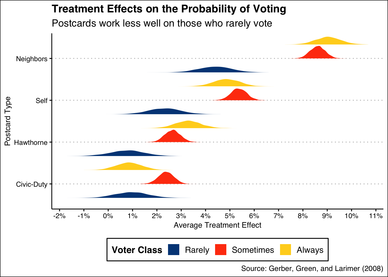
This is interesting! It shows us a few valuable bits of information:
- We are interested in the average treatment effect of postcards. There are 4 different postcards, each of which can be compared to what would have happened if the voter did not receive any postcard.
- These four treatment effects, however, are heterogeneous. They vary depending on an individual’s voting history, which we organize into three categories: Rarely Vote, Sometimes Vote and Always Vote. So, we have 12 different average treatment effects, one for each possible combination of postcard and voting history.
- For each of these combinations, the graphic shows our posterior distribution.
What does this mean for us, as we consider which postcards to send? * Consider the highest yellow distribution, which is the posterior distribution for the average treatment effect of receiving the Neighbors postcard (compared to not getting a postcard) for Always Voters. The posterior is centered around 9% with a 95% confidence interval of, roughly, 8% to 10%. * Overall, the Civic Duty and Hawthorne postcards had small average treatment effects, across all three categories of voter. The causal effect on Rarely Voters was much smaller, regardless of treatment. It was also much less precisely estimated because there were many fewer Rarely Voters in the data. *The best way to increase turnover, assuming there are limits to how many postcards you can send, is to focus on Sometimes/Always voters and to use the Neighbors postcard.
Conclusion: If we had a limited number of postcards, we would send the Neighbors postcard to citizens who already demonstrate a tendency to vote.
How confident are we in these findings? If we needed to convince our boss that this is the right strategy, we need to explain how confident we are in our assumptions. To do that, we must understand the three levels of knowledge in the world of posteriors.
10.4.2 Humility
We can never know the truth.
There exist three primary levels of knowledge possible knowledge in our scenario: the Truth (the ideal Preceptor Table), the DGM Posterior, and Our Posterior.
If we know the Truth (with a capital “T”), then we know the ideal Preceptor Table. With that knowledge, we can directly answer our question precisely. We can calculate each individual’s treatment effect, and any summary measure we might be interested in, like the average treatment effect.
This level of knowledge is possible only under an omniscient power, one who can see every outcome in every individual under every treatment. The Truth would show, for any given individual, their actions under control, their actions under treatment, and each little factor that impacted those decisions.
The Truth represents the highest level of knowledge one can have — with it, our questions merely require algebra. There is no need to estimate a treatment effect, or the different treatment effects for different groups of people. We would not need to predict at all — we would know.
The DGM posterior is the next level of knowledge, which lacks the omniscient quality of The Truth. This posterior is the posterior we would calculate if we had perfect knowledge of the data generating mechanism, meaning we have the correct model structure and exact parameter values. This is often falsely conflated with “Our posterior”, which is subject to error in model structure and parameter value estimations.
With the DGM posterior, we could not be certain about any individual’s causal effect, because of the Fundamental Problem of Causal Inference. In other words, we can never measure any one person’s causal effect because we are unable to see a person’s resulting behavior under treatment and control; we only have data on one of the two conditions.
What we do with the DGM posterior is the same as Our posterior — we estimate parameters based on data and predict the future with the latest and most relevant information possible. The difference is that, when we calculate posteriors for an unknown value in the DGM posterior, we expect those posteriors to be perfect.
If we go to our boss with our estimates from this posterior, we would expect our 95% confidence interval to be perfectly calibrated. That is, we would expect the true value to lie within the 95% confidence interval 95% of the time. In this world, we would be surprised to see values outside of the confidence interval more than 5% of the time.
Unfortunately, Our posterior possesses even less certainty! In the real world, we don’t have perfect knowledge of the DGM: the model structure and the exact parameter values. What does this mean?
When we go to our boss, we tell them that this is our best guess. It is an informed estimate based on the most relevant data possible. From that data, we have created a 95% confidence interval for the treatment effect of various postcards. We estimate that the treatment effect of the Neighbors postcard to be between 8% to 10%.
Does this mean we are certain that the treatment effect of Neighbors is between these values? Of course not! As we would tell our boss, it would not be shocking to find out that the actual treatment effect was less or more than our estimate.
This is because a lot of the assumptions we make during the process of building a model, the processes in Wisdom, are subject to error. Perhaps our data did not match the future as well as we had hoped. Ultimately, we try to account for our uncertainty in our estimates. Even with this safeguard, we aren’t surprised if we are a bit off.
For instance, would we be shocked if the treatment effect of the Neighbors postcard to be 7%? 12%? Of course not! That is only slightly off, and we know that Our posterior is subject to error. Would we be surprised if the treatment effect was found to be 20%? Yes. That is a large enough difference to suggest a real problem with our model, or some real world change that we forgot to factor into our predictions.
But, what amounts to a large enough difference to be a cause for concern? In other words, how wrong do we have to be in a one-off for our boss to be suspicious? When is “bad luck” a sign of stupidity? We will delve into this question in the next section of our chapter.
The world is always more uncertain than our models would have us believe.