The four Cardinal Virtues for working through a data science problem are Wisdom, Justice, Courage, and Temperance. The problem this time is a randomized experiment on nearly a million people — the largest dataset in this book — asking whether a piece of mail can change what a voter does.
Imagine that you are on the staff of the Philadelphia City Commissioners’ office ahead of the next general election. The Commissioners have a big-picture goal — make voting work smoothly for every registered Philadelphian — and a budget that does not stretch to every idea. They must decide how many postcards to print, which voters to mail them to, when to drop them, and what the postcards should say: is a mail ballot “safer for you,” or “safer for your neighborhood”? Each choice is worth a question you could ask out loud in the Commissioners’ meeting: Does a postcard move anyone to apply for a mail ballot at all? Does one wording work better than the other? Are older voters or younger voters more responsive? This chapter focuses on one estimate: the causal effect of each postcard wording on the share of registered voters who apply for a mail ballot, with its associated uncertainty. The estimate alone won’t set the budget, but it is one good input. There are many decisions to make.
The data we will work from is mail, available in the primer.data package: 935,707 registered Philadelphia voters from a 2020 field experiment, described in a paper entitled Results from a 2020 field experiment encouraging voting by mail. Each voter was randomly assigned to receive no postcard (888,750 voters), a postcard saying a mail ballot was “safer for you” (the Self arm, 23,472 voters), or a postcard saying it was “safer for your neighborhood” (the Neighborhood arm, 23,485 voters). The outcome column applied_mail records whether the county logged a mail-ballot application from the voter by Pennsylvania’s May 26, 2020 deadline. Covariates from the registration file include party, age (in bands), and sex. Our analysis tibble x keeps the 696,638 voters with a recorded sex.
12.1 Wisdom
Wisdom.
Wisdom begins with a question and then moves on to the creation of a Preceptor Table and an examination of our data.
Wisdom commits us to a question precise enough to be answered. The Preceptor Table makes the commitment concrete: it is the smallest table that, if every cell were filled in with the truth, would make the question’s answer easy to read off.
The combination of some data and an aching desire for an answer does not ensure that a reasonable answer can be extracted from a given body of data. — John W. Tukey
12.1.1 Mail voting in Pennsylvania, spring 2020
Two things collided to make this experiment possible. The first was legal: Pennsylvania’s Act 77, passed in October 2019, gave every voter in the state the right to vote by mail without an excuse — before Act 77, absentee ballots required a qualifying reason. The second was the pandemic: by the spring of 2020, with the state’s primary postponed from late April to June 2, voting in person suddenly carried a perceived health risk, and election offices scrambled to tell voters about an option most had never used. A voter who wanted a mail ballot for the June 2 primary had to apply for one by May 26 — and that application, logged in county records, is the outcome our data measures.
The application is worth distinguishing from the vote. Applying gets a ballot mailed to you; it does not return it, and some applicants never do. The Commissioners ultimately care about ballots cast, but a postcard can only plausibly move the first link in that chain — awareness and application — which is why the experiment measured applications.
12.1.2 The experiment
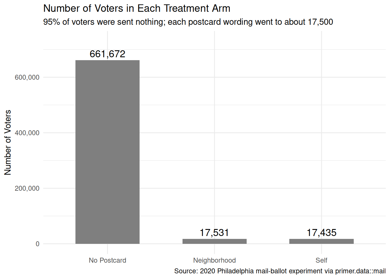
The experimenters worked from the city’s registration file and randomly assigned nearly a million voters to three arms. The design is strikingly unbalanced: about 95% of voters got nothing, while each treatment arm got roughly 23,500 postcards. That is not sloppiness — it is how field experiments economize. Postcards cost money to print and mail; control-group voters cost nothing. With a control group this large, the baseline application rate is estimated almost without error, and the experiment’s precision is limited only by the treatment arms’ size.
The two wordings operationalize a real messaging question. Both postcards told voters they could vote by mail; they differed in the beneficiary of the safety claim — you (“Self”) versus your neighborhood (“Neighborhood”). Behavioral research on voter mobilization has long found that appeals invoking others can outperform purely self-interested ones; the most famous result in that literature, the social-pressure mailer studied in the Shaming chapter, moved turnout by several whole percentage points. Whether a gentler, prosocial safety frame does anything similar for mail-ballot uptake is exactly what this experiment tests.
One vocabulary note that matters for everything downstream: treatment records the arm each voter was assigned to, meaning a postcard was mailed to their registration address. Some postcards were never delivered; many were never read. The effects this chapter estimates are therefore intent-to-treat effects — the effect of being sent a postcard, not of reading one.
12.1.3 The primary question
The primary question for this chapter is causal:
What is the average causal effect of each postcard wording — Self or Neighborhood, relative to no postcard — on the share of registered Philadelphia voters who apply for a mail ballot?
This is a causal question — the kind of question that calls for a causal model. It asks for two numbers, each a difference between potential outcomes: the application probability if sent a given postcard minus the application probability if sent nothing, averaged over voters. With a three-arm treatment, every voter has three potential outcomes — whether they would apply under no postcard, under Self, and under Neighborhood — and we observe exactly one of the three. That is the fundamental problem of causal inference, scaled up one arm.
Preceptor Table --- Primary (causal) question1
Unit2
Potential Outcomes3
Treatment4
Covariates5
Voter
Applied if No Postcard
Applied if Self
Applied if Neighborhood
Postcard
Party
Age
Sex
Denise Whitaker
No
No
Yes
Neighborhood
Democrat
50-64
Female
Gregory Boyle
No
No
No
No Postcard
Republican
30-39
Male
…
…
…
…
…
…
…
…
Alice Ferraro
Yes
Yes
Yes
Self
Democrat
65-121
Female
1 If all the information in this table were available, we could answer the question: What is the average causal effect of each postcard wording --- Self or Neighborhood, relative to no postcard --- on the share of registered Philadelphia voters who apply for a mail ballot?
2 Each row is one registered Philadelphia voter at the next general election --- roughly one million people. The example rows use plausible names; missing rows represent the rest of the rolls.
3 Three potential outcomes per voter: whether they would apply for a mail ballot under each postcard condition. The cross-hatched cells mark each voter's two unobservable potential outcomes --- the ones we could never see, because the voter was actually sent something else.
4 The postcard the voter is sent: No Postcard, Self ('safer for you'), or Neighborhood ('safer for your neighborhood').
5 Party from the registration file; age in the file's bands (18-29 through 65-121); sex as recorded on the rolls.
This is the first Preceptor Table in the book whose Potential Outcomes spanner stretches to three columns. The Rubin Causal Model scales without complaint: one potential outcome per treatment value, one observed, the rest counterfactual. Every pairwise contrast — Self versus nothing, Neighborhood versus nothing, Self versus Neighborhood — is a difference between two columns of which at most one is ever observed for any given voter.
12.1.4 Exploring the data
Before fitting a model, look at the data. You can never look too closely at your data — the hour spent on a careful EDA almost always saves a day downstream. Start with the outcome itself:
Show the code
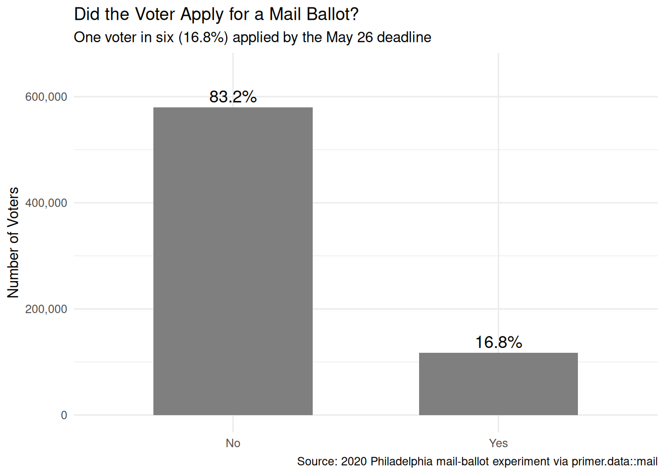
x|>count(applied_mail)|>mutate(share =n/sum(n))|>ggplot(aes(x =applied_mail, y =n))+geom_col(fill ="grey50", width =0.6)+geom_text(aes(label =scales::label_percent(accuracy =0.1)(share)), vjust =-0.4, size =4.5)+scale_y_continuous(labels =scales::label_comma(), limits =c(0, 650000))+labs( title ="Did the Voter Apply for a Mail Ballot?", subtitle ="One voter in six (16.8%) applied by the May 26 deadline", x =NULL, y ="Number of Voters", caption ="Source: 2020 Philadelphia mail-ballot experiment via primer.data::mail")+theme_minimal()
The outcome is binary and lopsided but nowhere near rare: 116,972 of our 696,638 voters applied. With six-figure counts in both bars, the baseline application rate is pinned down almost exactly, and any postcard effect will have to be read against that 16.8% floor.
Show the code
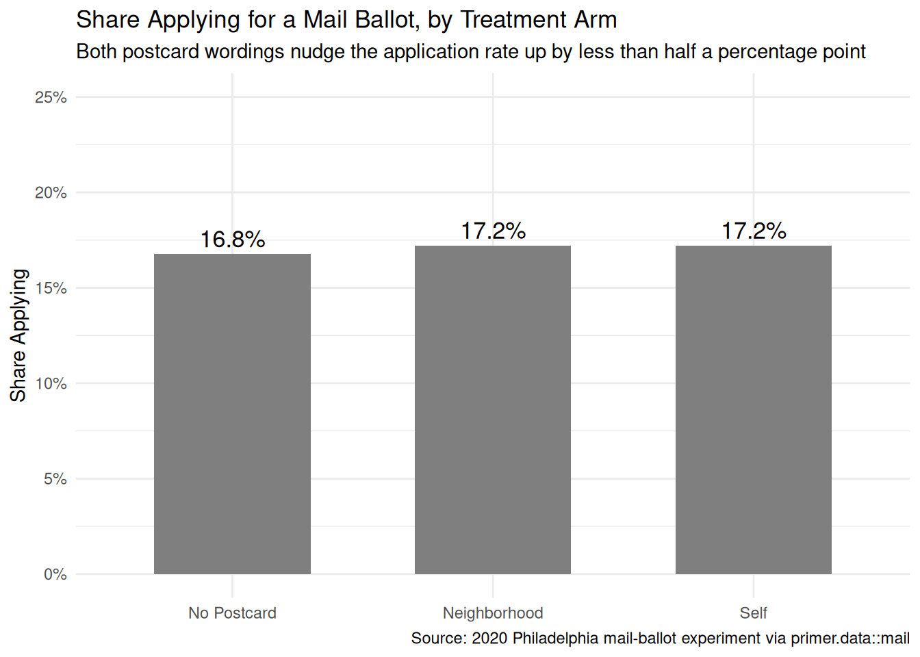
x|>count(treatment, applied_mail)|>group_by(treatment)|>mutate(share =n/sum(n))|>filter(applied_mail=="Yes")|>ggplot(aes(x =treatment, y =share))+geom_col(fill ="grey50", width =0.6)+geom_text(aes(label =scales::label_percent(accuracy =0.1)(share)), vjust =-0.4, size =4.5)+scale_y_continuous(labels =scales::label_percent(), limits =c(0, 0.25))+labs( title ="Share Applying for a Mail Ballot, by Treatment Arm", subtitle ="Both postcard wordings nudge the application rate up by less than half a percentage point", x =NULL, y ="Share Applying", caption ="Source: 2020 Philadelphia mail-ballot experiment via primer.data::mail")+theme_minimal()
The headline comparison, raw: 16.8% of control-group voters applied, against 17.2% in each treatment arm. Randomization means this simple comparison is already an unbiased causal estimate — and it is tiny. Whatever these postcards did, they did not do much of it.
The treatment variable’s own distribution shows the design those rates sit on:
Show the code
x|>count(treatment)|>ggplot(aes(x =treatment, y =n))+geom_col(fill ="grey50", width =0.6)+geom_text(aes(label =scales::label_comma()(n)), vjust =-0.4, size =4.5)+scale_y_continuous(labels =scales::label_comma(), limits =c(0, 730000))+labs( title ="Number of Voters in Each Treatment Arm", subtitle ="95% of voters were sent nothing; each postcard wording went to about 17,500", x =NULL, y ="Number of Voters", caption ="Source: 2020 Philadelphia mail-ballot experiment via primer.data::mail")+theme_minimal()
This is the deliberate imbalance described above, made visible: 661,672 control voters against 17,531 Neighborhood and 17,435 Self. The precision of every causal estimate downstream is set by the two small bars, not the big one.
Show the code
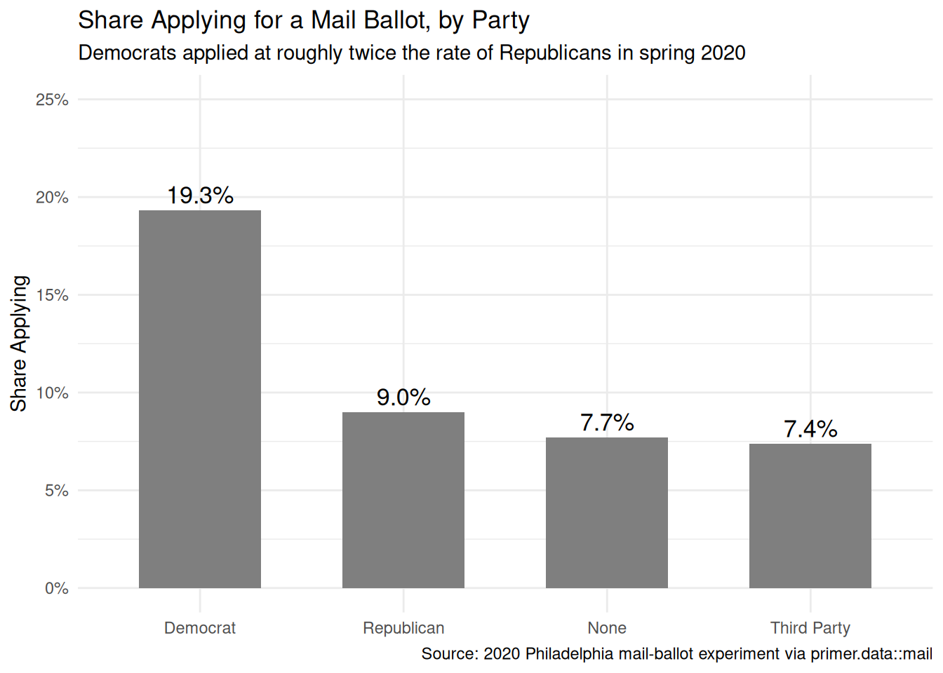
x|>count(party, applied_mail)|>group_by(party)|>mutate(share =n/sum(n))|>filter(applied_mail=="Yes")|>ggplot(aes(x =fct_reorder(party, -share), y =share))+geom_col(fill ="grey50", width =0.6)+geom_text(aes(label =scales::label_percent(accuracy =0.1)(share)), vjust =-0.4, size =4.5)+scale_y_continuous(labels =scales::label_percent(), limits =c(0, 0.25))+labs( title ="Share Applying for a Mail Ballot, by Party", subtitle ="Democrats applied at roughly twice the rate of Republicans in spring 2020", x =NULL, y ="Share Applying", caption ="Source: 2020 Philadelphia mail-ballot experiment via primer.data::mail")+theme_minimal()
Party, by contrast, moves the application rate enormously. By the spring of 2020, willingness to vote by mail had already polarized: Democratic messaging embraced it, Republican messaging disparaged it, and the application rates show the result. This is a covariate difference, not a causal effect of party — but its sheer size, next to the postcards’ half-point nudge, frames the whole problem.
Show the code
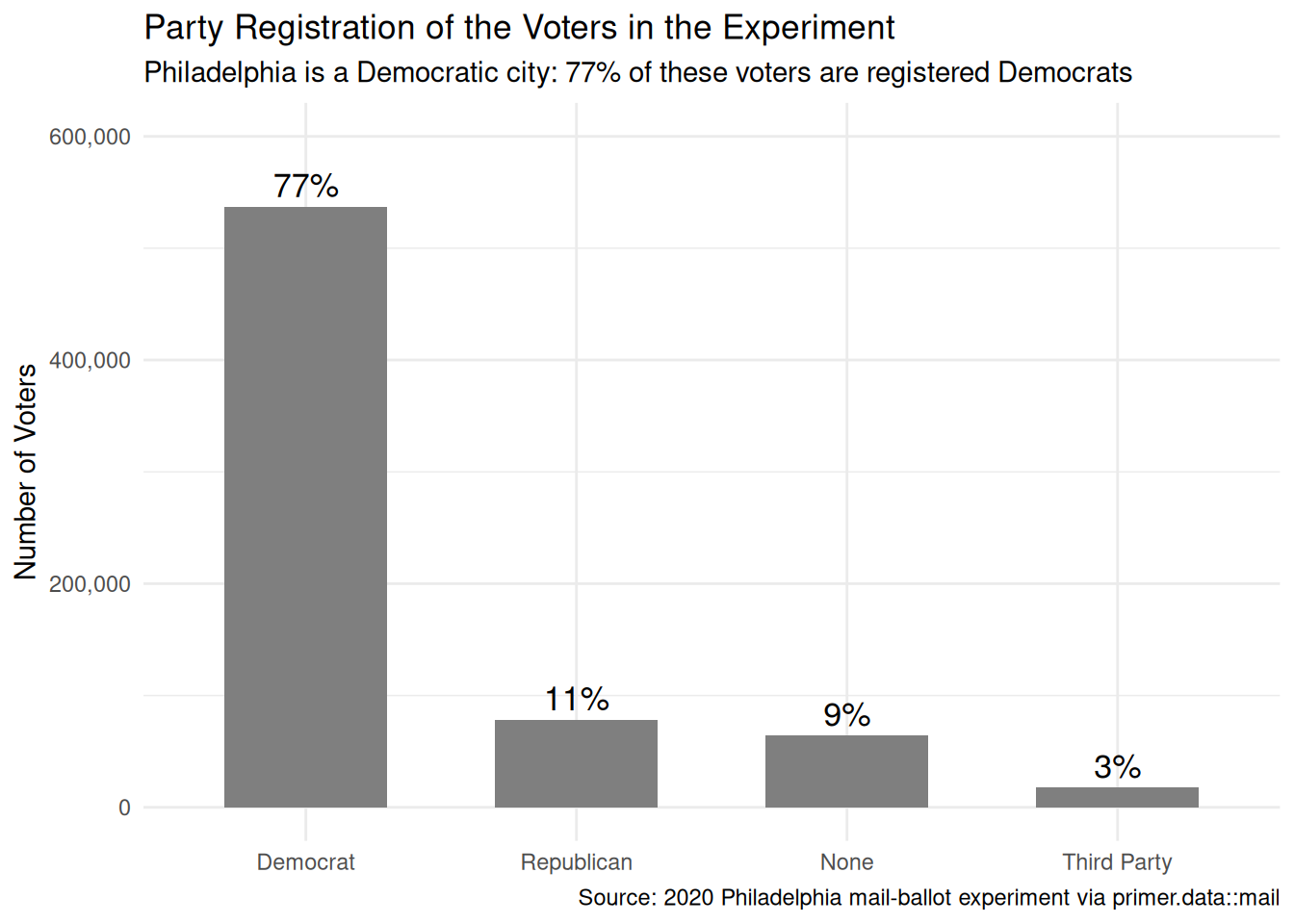
x|>count(party)|>mutate(party =fct_reorder(party, -n), share =n/sum(n))|>ggplot(aes(x =party, y =n))+geom_col(fill ="grey50", width =0.6)+geom_text(aes(label =scales::label_percent(accuracy =1)(share)), vjust =-0.4, size =4.5)+scale_y_continuous(labels =scales::label_comma(), limits =c(0, 600000))+labs( title ="Party Registration of the Voters in the Experiment", subtitle ="Philadelphia is a Democratic city: 77% of these voters are registered Democrats", x =NULL, y ="Number of Voters", caption ="Source: 2020 Philadelphia mail-ballot experiment via primer.data::mail")+theme_minimal()
Party’s own distribution is as lopsided as its rates: registered Democrats outnumber Republicans nearly seven to one, and the file carries four party values, with unaffiliated voters (“None”) their own category alongside Third Party. The model’s party coefficients for the three smaller groups rest on tens of thousands of voters each — still plenty — but the sample is overwhelmingly a sample of Democrats.
Show the code
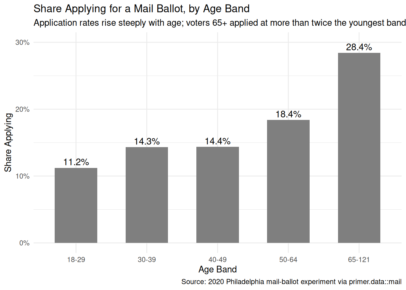
x|>count(age, applied_mail)|>group_by(age)|>mutate(share =n/sum(n))|>filter(applied_mail=="Yes")|>ggplot(aes(x =age, y =share))+geom_col(fill ="grey50", width =0.6)+geom_text(aes(label =scales::label_percent(accuracy =0.1)(share)), vjust =-0.4, size =4)+scale_y_continuous(labels =scales::label_percent(), limits =c(0, 0.3))+labs( title ="Share Applying for a Mail Ballot, by Age Band", subtitle ="Application rates rise steeply with age; voters 65+ applied at more than twice the youngest band's rate", x ="Age Band", y ="Share Applying", caption ="Source: 2020 Philadelphia mail-ballot experiment via primer.data::mail")+theme_minimal()
Age is the other big axis. Older voters — more exposed to pandemic risk, more habitual about voting — applied at much higher rates. Note that age in this file is banded (18-29 through 65-121), not a number: the model will treat it as a five-level categorical variable with four dummies, not a slope.
Show the code
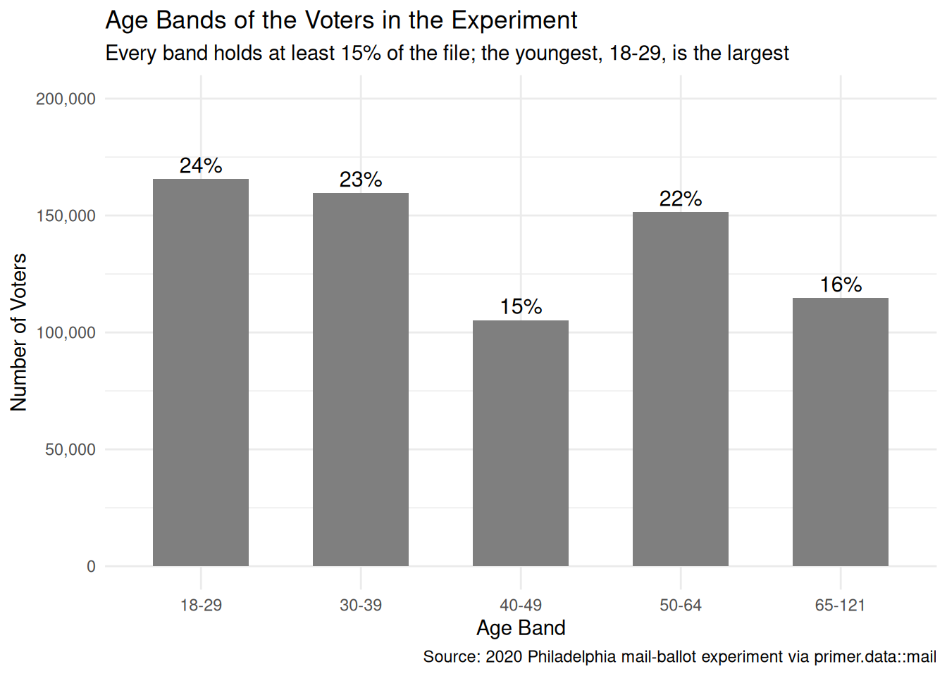
x|>count(age)|>mutate(share =n/sum(n))|>ggplot(aes(x =age, y =n))+geom_col(fill ="grey50", width =0.6)+geom_text(aes(label =scales::label_percent(accuracy =1)(share)), vjust =-0.4, size =4)+scale_y_continuous(labels =scales::label_comma(), limits =c(0, 200000))+labs( title ="Age Bands of the Voters in the Experiment", subtitle ="Every band holds at least 15% of the file; the youngest, 18-29, is the largest", x ="Age Band", y ="Number of Voters", caption ="Source: 2020 Philadelphia mail-ballot experiment via primer.data::mail")+theme_minimal()
Unlike party, age is comfortably spread: every band holds between 105,263 and 165,614 voters, so each of the model’s four age dummies is estimated from a six-figure group.
Show the code
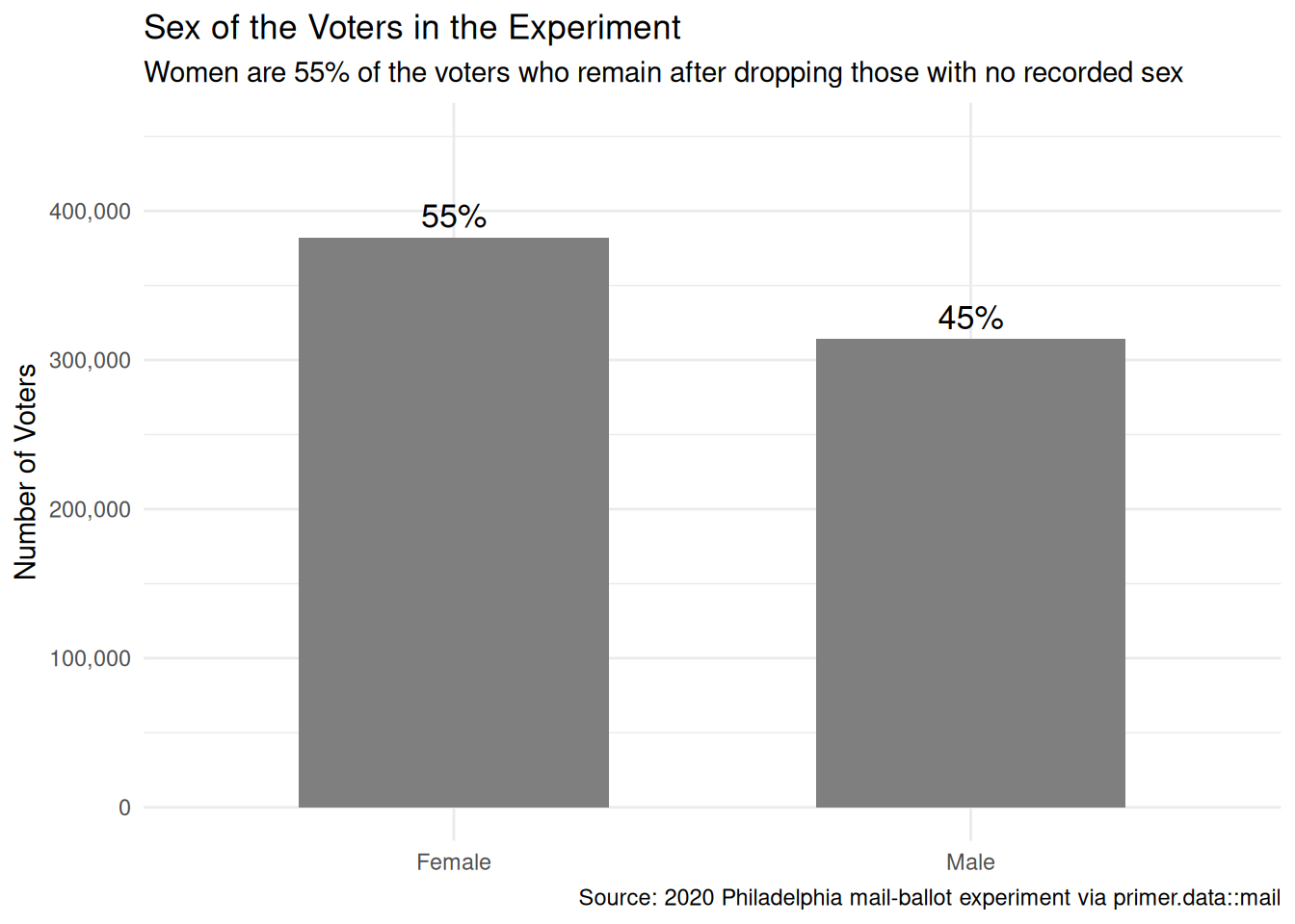
x|>count(sex)|>mutate(share =n/sum(n))|>ggplot(aes(x =sex, y =n))+geom_col(fill ="grey50", width =0.6)+geom_text(aes(label =scales::label_percent(accuracy =1)(share)), vjust =-0.4, size =4.5)+scale_y_continuous(labels =scales::label_comma(), limits =c(0, 450000))+labs( title ="Sex of the Voters in the Experiment", subtitle ="Women are 55% of the voters who remain after dropping those with no recorded sex", x =NULL, y ="Number of Voters", caption ="Source: 2020 Philadelphia mail-ballot experiment via primer.data::mail")+theme_minimal()
Sex, the last covariate in the model, splits 382,332 women to 314,306 men — but remember that this plot shows only the voters who have a recorded sex. The 239,069 voters dropped for missing sex are the EDA’s biggest red flag, taken up in the first bullet below and again in Justice.
A few specifics worth flagging from the EDA:
A quarter of the file is missing sex. The raw data has 935,707 voters; 239,069 have no recorded sex, and our drop_na() keeps 696,638. Registration records collect sex inconsistently across registration channels and eras, so the missingness is unlikely to be random — Justice takes this up under representativeness.
The outcome must be a factor.logistic_reg(engine = "glm") refuses a non-factor outcome; the data prep converts applied_mail explicitly.
The treatment’s default reference level is wrong for us. R’s alphabetical ordering would make Neighborhood the reference; our fct_relevel(treatment, "No Postcard") makes the control group the baseline, so every model coefficient is measured against no postcard — the comparison the question asks about.
12.1.5 The paired question
The difference between predictive models and causal models is that the former have one column for the outcome variable and the latter have more than one column.
Every question has a shadow in the opposite framing. Since our primary question is causal, the paired question is predictive:
What is the difference in the probability of applying for a mail ballot between voters who were sent a Neighborhood postcard and voters who were sent no postcard?
Nothing about this question is absurd — it is the modest, defensible version of the primary. It asks only for a comparison between two groups: the voters who happen to have been sent the Neighborhood postcard, versus the voters who were not. No counterfactual, no potential outcomes, no claim about what the postcard did to anyone. An analyst who distrusted the experiment entirely — who suspected the randomization was botched — could still answer the paired question honestly.
Preceptor Table --- Paired (predictive) question1
Unit2
Outcome3
Covariates4
Voter
Applied
Postcard
Party
Age
Sex
Denise Whitaker
Yes
Neighborhood
Democrat
50-64
Female
Gregory Boyle
No
No Postcard
Republican
30-39
Male
…
…
…
…
…
…
Alice Ferraro
Yes
Self
Democrat
65-121
Female
1 If all the information in this table were available, we could answer the question: What is the difference in the probability of applying for a mail ballot between voters who were sent a Neighborhood postcard and voters who were sent no postcard?
2 Each row is one registered Philadelphia voter at the next general election, as in the primary Preceptor Table.
3 One observed outcome per voter: whether they applied for a mail ballot. No potential outcomes --- the predictive framing needs none.
4 The same Postcard column that sat under a Treatment spanner in the primary Preceptor Table sits here under the Covariates spanner, alongside party, age, and sex. The columns are identical; only the analyst's commitment changed.
The two Preceptor Tables differ in exactly the bookkeeping that distinguishes causal from predictive:
The primary table has three potential-outcome columns; the paired table has one observed outcome column, and the hatching disappears with the counterfactuals.
The primary table has Postcard under a Treatment spanner; the paired table files the same column under Covariates, alongside party, age, and sex. The columns are identical.
The same fitted model serves both questions. What the randomized design buys — and this is the deep point of the pair — is that here, unlike in the NES and Smokes chapters, the two readings give answers that should coincide: when treatment assignment is random, the between-group comparison the predictive question asks about is an unbiased estimate of the causal effect the primary question asks about. Randomization is what welds the two framings together.
12.2 Justice
Justice.
Justice concerns the Population Table, the four key assumptions which underlie it (validity, stability, representativeness, and unconfoundedness), and the choice of probability family and link function for the data generating mechanism.
Justice is where you (or your critics) raise concerns about whether the model will do what you want it to do. The four assumptions are the named families of concerns; they are not testable from the data alone, they are choices the analyst makes and defends.
The bridge runs data → population → Preceptor Table. Justice’s job is to make sure both arrows are defensible.
There are known knowns. There are things we know we know. We also know there are known unknowns. That is to say, we know there are some things we do not know. But there are also unknown unknowns, the ones we do not know we do not know. — Donald Rumsfeld
12.2.1 The Population Table for the primary question
Population Table --- Primary question1
Source
Unit/Time2
Potential Outcomes3
Treatment4
Covariates5
Voter
Year
Applied if No Postcard
Applied if Self
Applied if Neighborhood
Postcard
Party
Age
Sex
…
…
…
…
…
…
…
…
…
…
Data
Voter 100482
2020
…
…
Yes
Neighborhood
Democrat
50-64
Female
Data
Voter 315207
2020
No
…
…
No Postcard
Republican
30-39
Male
Data
…
…
…
…
…
…
…
…
…
Data
Voter 771354
2020
…
No
…
Self
Democrat
65-121
Female
…
…
…
…
…
…
…
…
…
…
Preceptor
Denise Whitaker
2026
No
No
Yes
Neighborhood
Democrat
50-64
Female
Preceptor
Gregory Boyle
2026
No
No
No
No Postcard
Republican
30-39
Male
Preceptor
…
…
…
…
…
…
…
…
…
Preceptor
Alice Ferraro
2026
Yes
Yes
Yes
Self
Democrat
65-121
Female
…
…
…
…
…
…
…
…
…
…
1 This table combines the 2020 experiment with the Preceptor Table's next-election voters, drawn from the same population of registered Philadelphia voters across elections from 2020 through the Commissioners' planning horizon.
2 Data rows are 2020 experiment participants (anonymized records, not names); Preceptor rows are voters on the rolls at the next general election. The pandemic-to-ordinary-times gap between the blocks is the heart of the stability discussion.
3 In Data rows, only the potential outcome matching the assigned arm was observed; the other two are shown as '...' because no one measured them. In Preceptor rows, all three potential outcomes are filled in with the truth, and the two unobservable ones are cross-hatched.
4 In Data rows, the arm was randomly assigned by the experimenters --- the basis for unconfoundedness. In Preceptor rows, it is whatever postcard the Commissioners choose to send.
5 Party, age band, and sex from the registration file, recorded the same way in both blocks.
12.2.2 Validity
Validity is the consistency, or lack thereof, in the columns of the data set and the corresponding columns in the Preceptor Table.
Validity is about columns. Two columns can have the same name and measure different things.
The outcome column is on firm ground. An application logged in county records means the same administrative fact in any year: a form arrived, a ballot went out. Little slippage there.
The treatment column is the worry. The data’s treatment is being mailed a safety-framed postcard in May 2020, when a pandemic made “safer for you” a matter of life and death and mail voting was a novelty most Philadelphians had never tried. The Preceptor Table’s treatment is being mailed the same words at an ordinary election, when “safer” has lost that resonance and mail voting is routine. The two columns share a label — Neighborhood postcard — but the treatment a voter experiences is tied to its moment. Same ink, different intervention.
12.2.3 Stability
Stability means that the relationship between the columns in the Population Table is the same for three categories of rows: the data, the Preceptor Table, and the larger population from which both are drawn.
Stability is a statement about parameters, not distributions — and this chapter is the curriculum’s sharpest stability case, the mirror image of NES’s gentlest one. Our model’s treatment coefficients measure the bump a postcard gives to the log-odds of applying. Stability says that bump is the same in spring 2020 as at the election the Commissioners are planning. There is every reason to doubt it: the 2020 postcard landed on voters who had never heard of no-excuse mail voting, during a health emergency that made its message urgent. At the next ordinary election the information is stale and the safety frame is inert. The treatment-effect parameter was plausibly at its lifetime maximum in our data.
The confusion to avoid: mail-ballot usage exploding after 2020 is a distribution shift, not a stability violation. More people applying does not, by itself, change the postcard coefficient. What violates stability is the parameter moving — the same postcard producing a different-sized nudge. Here we have good reason to fear both happened, but only the second breaks the model.
12.2.4 Representativeness
Representativeness, or the lack thereof, concerns two relationships among the rows in the Population Table. The first is between the data and the other rows. The second is between the other rows and the Preceptor Table.
Data → population. The experiment covered essentially the whole registration file — as close to a census of the population of interest as data in this book ever gets. But our cleaned tibble is not the whole file: we dropped the 239,069 voters (a quarter of the file) whose sex is missing. Missing sex is not random — it tracks registration channel and era, which track age, party, and mail-voting propensity — so the 696,638 voters we model may differ systematically from the full rolls.
Population → Preceptor Table. Registration files churn. New voters register, movers leave, inactive registrations are purged; the rolls at the next general election will contain hundreds of thousands of people who were not in our population at all, disproportionately young and recently arrived. Inferences tuned to the 2020-era file need not carry over to a file whose composition has turned over.
A non-representative sample doesn’t guarantee a biased estimate — but chance is the only mechanism that would save us, and we have no principled reason to expect it to.
Unconfoundedness means that the treatment assignment is independent of the potential outcomes, when we condition on pre-treatment covariates.
Unconfoundedness applies to the primary causal question; the paired predictive question does not require it.
Here — for once — the assumption is strong, because the experimenters made it true by construction: postcards were randomly assigned. A voter’s potential outcomes (would they apply under each condition?) had no way to influence which arm they landed in. This is what randomized experiments buy, and it is why the raw arm-by-arm comparison in the EDA was already a legitimate causal estimate.
The honest residual worry sits between assignment and delivery. Postcards mailed to stale addresses never arrive, and voters with stale addresses — recent movers, infrequent voters — have systematically different application propensities. Assignment is unconfounded; the treatment actually experienced is not perfectly so. This is why the chapter’s estimates are intent-to-treat effects: the effect of being sent a postcard is protected by randomization even when the effect of reading one is not.
12.2.6 The Population Table for the paired question
The paired Population Table has the same row structure as the primary but collapses to a single observed outcome column — no potential outcomes, no hatching, and the postcard filed under Covariates.
Population Table --- Paired question1
Source
Unit/Time2
Outcome3
Covariates4
Voter
Year
Applied
Postcard
Party
Age
Sex
…
…
…
…
…
…
…
…
Data
Voter 100482
2020
Yes
Neighborhood
Democrat
50-64
Female
Data
Voter 315207
2020
No
No Postcard
Republican
30-39
Male
Data
…
…
…
…
…
…
…
Data
Voter 771354
2020
No
Self
Democrat
65-121
Female
…
…
…
…
…
…
…
…
Preceptor
Denise Whitaker
2026
Yes
Neighborhood
Democrat
50-64
Female
Preceptor
Gregory Boyle
2026
No
No Postcard
Republican
30-39
Male
Preceptor
…
…
…
…
…
…
…
Preceptor
Alice Ferraro
2026
Yes
Self
Democrat
65-121
Female
…
…
…
…
…
…
…
…
1 Same row structure as the primary Population Table, with one observed outcome column instead of three potential-outcome columns. No hatching: the predictive framing has no counterfactuals.
2 Data rows are 2020 experiment participants; Preceptor rows are voters at the next general election.
3 Whether the voter applied for a mail ballot --- one observed value per row.
4 The postcard, party, age band, and sex, all under Covariates: in the predictive framing the postcard is just another attribute a voter has.
12.2.7 Probability family and link function
The outcome applied_mail is a binary variable (Yes/No, encoded as a factor for tidymodels). The probability family for a binary outcome is Bernoulli:
\[Y \sim \text{Bernoulli}(\rho)\]
The link function for a binary outcome is the logit:
Our model will be a logistic regression, as in Smokes. The covariates we use are settled in Courage.
12.3 Courage
Courage.
Courage creates the data generating mechanism.
The three languages of data science are words, math, and code, and the most important of these is code. Justice settled the structural choices — binary outcome, Bernoulli family, logit link. Courage picks covariates, writes the model in code, and estimates the parameters.
12.3.1 Candidate models
We try three specifications: treatment alone, treatment with one adjustment covariate, and the full model.
12.3.1.1 Candidate 1: applied_mail ~ treatment
Show the code
logistic_reg(engine ="glm")|>fit(applied_mail~treatment, data =x)|>tidy(conf.int =TRUE)|>select(term, estimate, conf.low, conf.high)|>mutate(across(where(is.numeric), \(v)round(v, 3)))|>kable(caption ="Candidate model: applied_mail ~ treatment. Coefficients on the log-odds scale. Source: 2020 Philadelphia mail-ballot experiment via primer.data::mail.")
Candidate model: applied_mail ~ treatment. Coefficients on the log-odds scale. Source: 2020 Philadelphia mail-ballot experiment via primer.data::mail.
term
estimate
conf.low
conf.high
(Intercept)
-1.602
-1.609
-1.596
treatmentNeighborhood
0.032
-0.008
0.071
treatmentSelf
0.032
-0.008
0.072
Because the treatment was randomized, this unadjusted model already delivers legitimate causal estimates. Both treatment coefficients are positive and small — about +0.032 on the log-odds scale for each wording — with confidence intervals ([-0.008, 0.071] for each) that include zero. Even with nearly 700,000 voters, the data cannot rule out an effect of nothing.
12.3.1.2 Candidate 2: applied_mail ~ treatment + party
Show the code
logistic_reg(engine ="glm")|>fit(applied_mail~treatment+party, data =x)|>tidy(conf.int =TRUE)|>select(term, estimate, conf.low, conf.high)|>mutate(across(where(is.numeric), \(v)round(v, 3)))|>kable(caption ="Candidate model: applied_mail ~ treatment + party. Coefficients on the log-odds scale. Source: 2020 Philadelphia mail-ballot experiment via primer.data::mail.")
Candidate model: applied_mail ~ treatment + party. Coefficients on the log-odds scale. Source: 2020 Philadelphia mail-ballot experiment via primer.data::mail.
term
estimate
conf.low
conf.high
(Intercept)
-1.431
-1.438
-1.424
treatmentNeighborhood
0.034
-0.007
0.073
treatmentSelf
0.031
-0.009
0.071
partyNone
-1.055
-1.085
-1.025
partyRepublican
-0.886
-0.911
-0.860
partyThird Party
-1.103
-1.160
-1.046
Adding party does two things. It confirms the randomization: the treatment coefficients barely move (+0.034 and +0.031, versus +0.032 unadjusted), which is exactly what random assignment promises — treatment is unrelated to party, so adjusting for party changes almost nothing. And it puts the treatment’s size in perspective: the party coefficients are twenty-five times larger (Republicans sit about 0.89 log-odds below Democrats), a reminder that in this problem the covariates dwarf the treatment.
12.3.1.3 Candidate 3: applied_mail ~ treatment + party + age + sex
Show the code
logistic_reg(engine ="glm")|>fit(applied_mail~treatment+party+age+sex, data =x)|>tidy(conf.int =TRUE)|>select(term, estimate, conf.low, conf.high)|>mutate(across(where(is.numeric), \(v)round(v, 3)))|>kable(caption ="Candidate model: applied_mail ~ treatment + party + age + sex. Coefficients on the log-odds scale. Source: 2020 Philadelphia mail-ballot experiment via primer.data::mail.")
Candidate model: applied_mail ~ treatment + party + age + sex. Coefficients on the log-odds scale. Source: 2020 Philadelphia mail-ballot experiment via primer.data::mail.
term
estimate
conf.low
conf.high
(Intercept)
-1.749
-1.765
-1.732
treatmentNeighborhood
0.035
-0.006
0.076
treatmentSelf
0.030
-0.011
0.071
partyNone
-0.864
-0.894
-0.834
partyRepublican
-0.933
-0.959
-0.908
partyThird Party
-0.950
-1.008
-0.893
age30-39
0.276
0.255
0.296
age40-49
0.270
0.247
0.293
age50-64
0.554
0.533
0.574
age65-121
1.112
1.092
1.133
sexMale
-0.355
-0.368
-0.341
The full model adds the age bands (four dummies against the 18-29 reference, rising to +1.11 for voters 65 and over) and sex (-0.355 for men). The treatment coefficients settle at +0.035 (Neighborhood) and +0.030 (Self), each still with an interval that includes zero. Every coefficient in this table except the two we care about is precisely estimated and far from zero — the demographics of who votes by mail are strong and clear; the postcards’ effect on it is small and uncertain.
12.3.2 The chosen DGM
The full model is the one we commit to — not because adjustment was needed for causal validity (randomization handled that), but because the covariates sharpen the precision of everything the model predicts:
Show the code
fit_mail<-logistic_reg(engine ="glm")|>fit(applied_mail~treatment+party+age+sex, data =x)
Every term is a 0/1 dummy. The intercept (-1.75) is the log-odds of applying for the reference voter: sent no postcard, registered Democrat, aged 18-29, female — a probability of about 15%. Each coefficient shifts that log-odds when its dummy switches on.
The equation’s \(\eta\) (the log-odds), the probability it becomes, and the class a highest-probability rule would assign are all expected-value readings of the one DGM. When a question needs an individual outcome, the randomness enters at the final step: whether a given voter actually applies is a draw, \(Y \sim \text{Bernoulli}(\widehat{\rho})\). Voters with identical covariates share a probability — about one in six for the reference voter — not a decision.
This is our data generating mechanism. It serves both the primary causal question and the paired predictive question.
12.4 Temperance
Temperance.
Temperance interprets the data generating mechanism and then uses it to answer, with the help of graphics, the question(s) with which we began. Humility reminds us that this answer is always false.
In the modern world, all parameters are nuisance parameters. Eleven coefficients, and the two we care about are the two smallest in the equation. What we want is the causal effect on the probability scale, in percentage points a Commissioner can budget against. The tool is the marginaleffects package, with companion book Model to Meaning by Vincent Arel-Bundock.
12.4.1 The primary (causal) reading
Show the code
avg_comparisons(extract_fit_engine(fit_mail), variables ="treatment")|>as_tibble()|>mutate(wording =if_else(str_detect(contrast, "Self"), "Self", "Neighborhood"))|>ggplot(aes(x =estimate, y =wording))+geom_vline(xintercept =0, linetype ="dashed", color ="grey40")+geom_pointrange(aes(xmin =conf.low, xmax =conf.high), linewidth =0.8)+scale_x_continuous(labels =scales::label_percent(accuracy =0.1))+labs( title ="Causal Effect of Each Postcard on Mail-Ballot Applications", subtitle ="Both wordings move applications by less than half a percentage point, and zero is inside both intervals", x ="Change in Probability of Applying (percentage points)", y =NULL, caption ="Source: 2020 Philadelphia mail-ballot experiment via primer.data::mail")+theme_minimal()
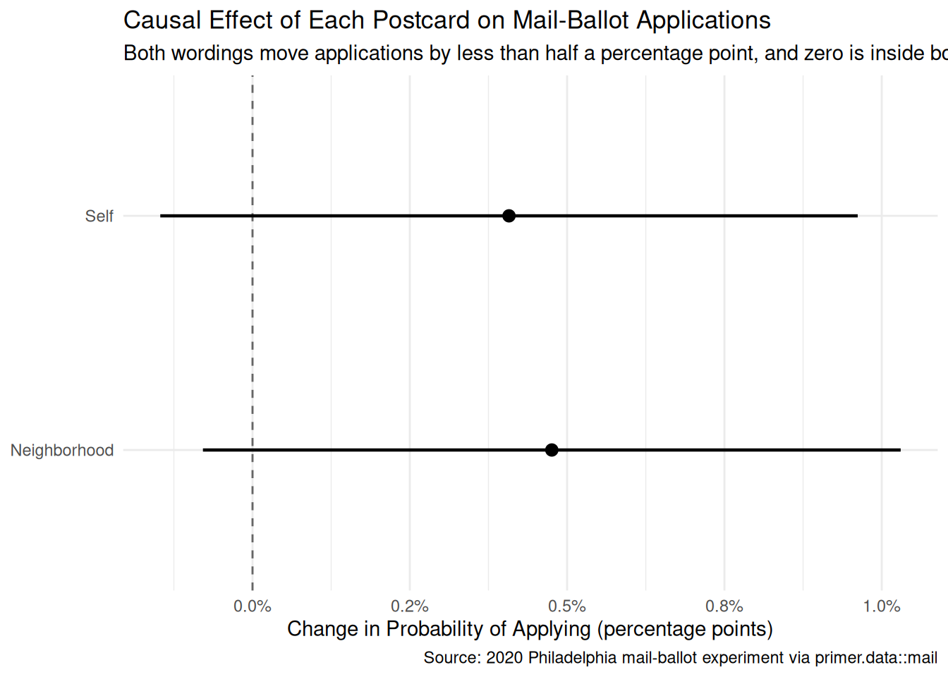
The primary question was “What is the average causal effect of each postcard wording on the share of registered voters who apply for a mail ballot?” The model’s answer, computed with avg_comparisons():
Neighborhood postcard: about +0.48 percentage points, 95% CI roughly [-0.1, +1.0].
Self postcard: about +0.41 percentage points, 95% CI roughly [-0.2, +1.0].
Causal language is earned here — randomization did the earning. Being sent the Neighborhood postcard raised the share of voters who apply by about half a percentage point is a legitimate sentence, with the one honest hedge that the interval includes zero. Two further readings of the same numbers:
The wordings are indistinguishable from each other. The 0.07-point difference between Neighborhood and Self is far inside either interval. Whatever prosocial framing did for the Shaming chapter’s social-pressure mailers, the “neighborhood” frame bought nothing detectable here.
Precision is not effect size. These are among the most precisely estimated numbers in this book — intervals barely a percentage point wide — and they still cannot exclude zero, because the true effect is tiny. A large sample buys narrow intervals; it cannot buy a bigger effect.
And the percentage-points note, as always: +0.48 percentage points on a 16.8% base rate is about a 3% relative increase. Confusing points with percent would overstate these postcards tenfold.
12.4.2 The paired (predictive) reading
The paired question was “What is the difference in the probability of applying between voters sent a Neighborhood postcard and voters sent no postcard?” The same fitted model gives essentially the same number: about half a percentage point, comparing the two groups.
In the NES and Smokes chapters, the paired reading was the honest one and the causal reading was absurd. Here the roles reverse — and then, remarkably, converge. The predictive reading (the Neighborhood-postcard group applied at a rate about half a point higher) is true and safe. The causal reading (the postcard caused that half-point) is also defensible, because random assignment guarantees the two groups differed, in expectation, in nothing but the postcard. Randomization is the bridge that lets a between-group comparison carry causal weight. When the treatment is a coin flip, the paired question and the primary question have the same answer; when it is not — as with sex in NES — they can differ without bound.
12.4.3 QoI variety
The chapter has answered the specific question we asked: two intent-to-treat effects, in percentage points. That is one pair of numbers in a family. The Commissioners’ office would also want:
Applications per print run. Half a percentage point applied to a hypothetical million-postcard campaign is about 5,000 extra applications — if the 2020 effect carried over, which Justice gave us reasons to doubt. The arithmetic is trivial once the effect is estimated; the stability caveat is the hard part.
Heterogeneity. Does the postcard move infrequent voters more than habitual ones? Older voters more than younger? comparisons() by subgroup answers this from the same fit — and with effects this small overall, targeting the responsive subgroup (if one exists) is the only way a postcard campaign earns its postage.
The next link in the chain. Applications are not returned ballots. The data records voted_mail too; re-running the analysis with that outcome asks whether the postcard’s nudge survives to an actual vote, or evaporates among people who apply and never return the ballot.
12.4.4 Why the answer is wrong
We can never know the truth.
Three things are likely wrong with our answer.
First, the stability gap — the big one. The experiment ran in the strangest voting environment in living memory: a new law, a pandemic, a postponed primary, safety messaging everywhere. The half-point effects we estimate are plausibly upper bounds for what the same postcards would do at an ordinary election, and the honest forecast for the Commissioners shades toward zero.
Second, the representativeness gaps. A quarter of the file was dropped for missing sex, and the registration rolls the Commissioners will actually mail to, years later, contain different people. Neither gap has a knowable direction.
Third, the world is always more uncertain than our models would have us believe. The reported intervals capture sampling uncertainty under the model, and here sampling uncertainty is nearly the smallest of our problems. The honest interval for the next election’s postcard effect is wider than [-0.1, +1.0] percentage points, and centered lower.
12.5 Summary
Show the code
avg_comparisons(extract_fit_engine(fit_mail), variables ="treatment")|>as_tibble()|>mutate(wording =if_else(str_detect(contrast, "Self"), "Self", "Neighborhood"))|>ggplot(aes(x =estimate, y =wording))+geom_vline(xintercept =0, linetype ="dashed", color ="grey40")+geom_pointrange(aes(xmin =conf.low, xmax =conf.high), linewidth =0.8)+scale_x_continuous(labels =scales::label_percent(accuracy =0.1))+labs( title ="Causal Effect of Each Postcard on Mail-Ballot Applications", subtitle ="Both wordings move applications by less than half a percentage point, and zero is inside both intervals", x ="Change in Probability of Applying (percentage points)", y =NULL, caption ="Source: 2020 Philadelphia mail-ballot experiment via primer.data::mail")+theme_minimal()
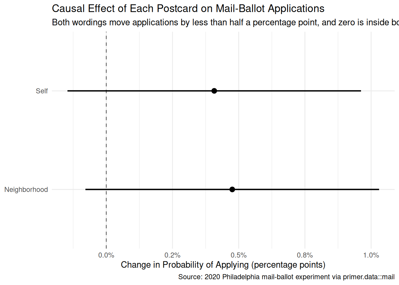
Election offices spend real money encouraging voters to use mail ballots, usually without evidence about whether the encouragement works. Using a randomized field experiment covering nearly a million registered Philadelphia voters in the spring of 2020 — the first election season under Pennsylvania’s new no-excuse mail-voting law, and the first under a pandemic — we estimated the causal effect of two postcard wordings, “safer for you” and “safer for your neighborhood,” on the share of voters who apply for a mail ballot. We modeled the binary application outcome as a Bernoulli variable which is a logistic function of treatment assignment, party, age, and sex, and read the fit two ways: as the causal intent-to-treat effect the randomized design licenses, and as the paired predictive comparison between groups — two readings that randomization welds into one. The estimate: the Neighborhood wording raised applications by about 0.5 percentage points (95% confidence interval roughly [-0.1, +1.0]) and the Self wording by about 0.4 percentage points (roughly [-0.2, +1.0]) — effects too small to distinguish from zero, or from each other, even with 696,638 voters. Stability (a pandemic-era treatment at its lifetime-maximum salience), representativeness (a quarter of the file dropped for missing sex; churning rolls), and the application-to-ballot gap all push the honest forecast for an ordinary election lower still.
For the Commissioners, the practical reading is blunt: informational safety-framed postcards, in the one setting most favorable to them, bought about half a percentage point of applications — while the Shaming chapter’s social-pressure mailers moved turnout by several whole points. If the office mails anything, the evidence says the wording between “you” and “your neighborhood” does not matter; whether to mail at all is a cost-per-application calculation the chapter’s numbers make possible but do not settle.
The world is always more uncertain than our models would have us believe.